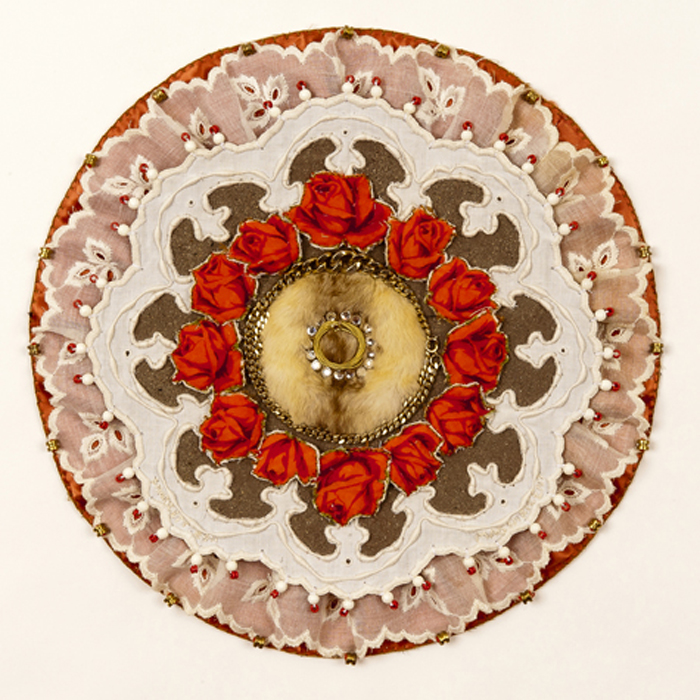
Painter's Passion
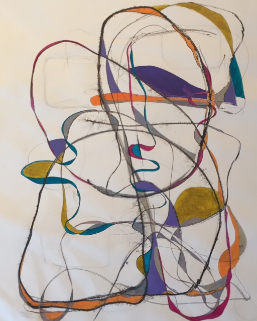
A Line’s Journey
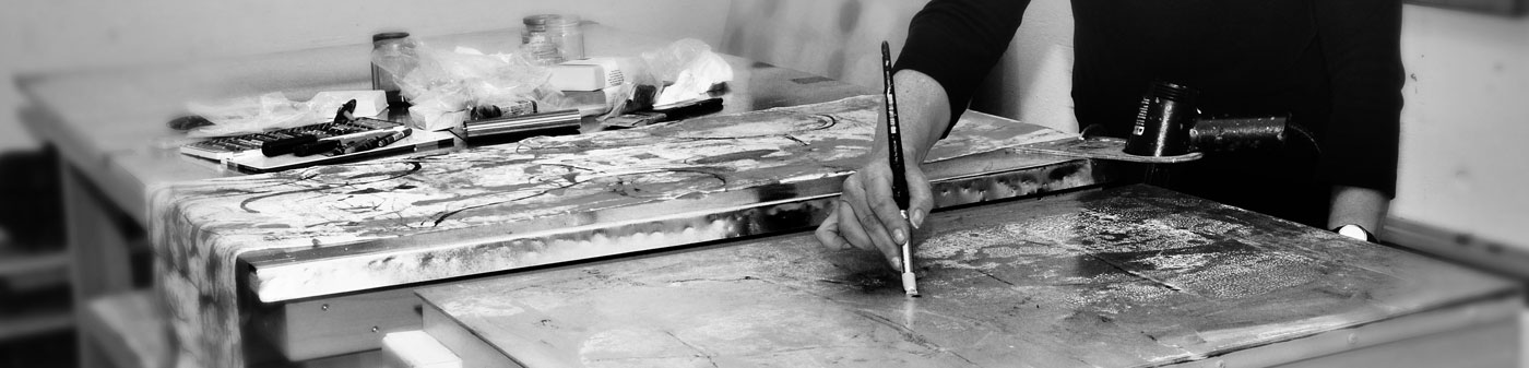
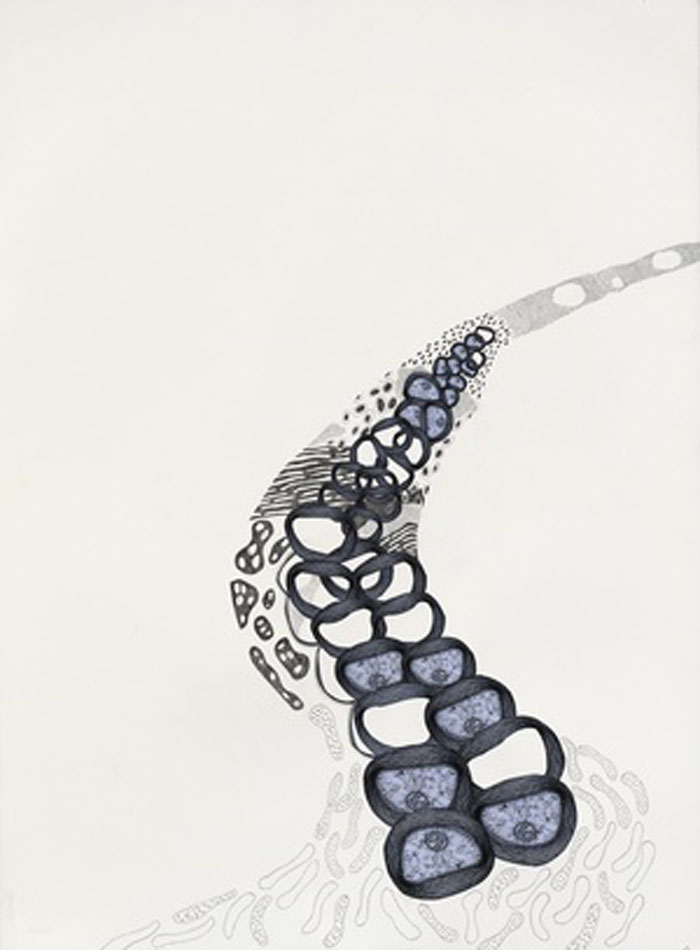
After 10 years of declining health, my mother at 92 years old, died on January 25 of this year. I was able to spend almost every day with her during those years and while I knew the end was near, I had no idea how profoundly her death would affect me. Struggling to focus, especially in the studio, and finding myself edgy and angry as I tried to process and find meaning, I gave myself a gift of a week in Mexico with time to walk, read and draw, all things I really enjoy. I decided to embark on a thirty day, thirty minute for thirty drawings exploration and challenge.

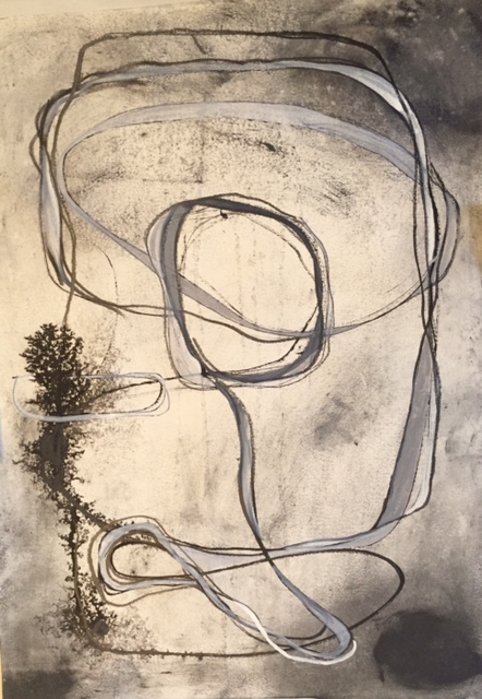
This is the first drawing, ink and graphite, done on April 22 while in San Jose del Cabo. I posted each drawing for thirty days on Instagram and the first comment from an artist who doesn’t know me was, “there’s something very vulnerable about this drawing”. This one is so minimal, stripped down to its essence. Hmm, maybe I was on to something…
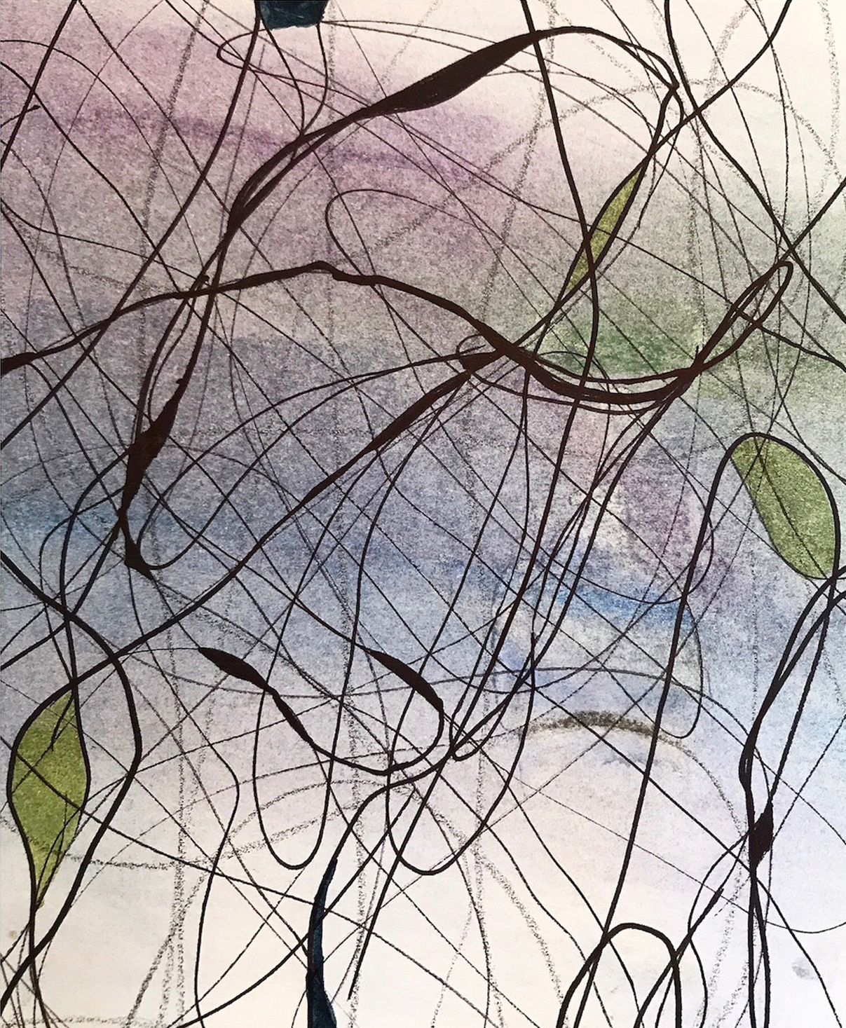
I’m not including all thirty drawings, but this one was the fourth. I worked with graphite, ink and pastel, blurring some lines while others are more distinct, a nice contrast. I tried not to think of anything, not to judge myself, just to be totally present and focused during those thirty minutes.
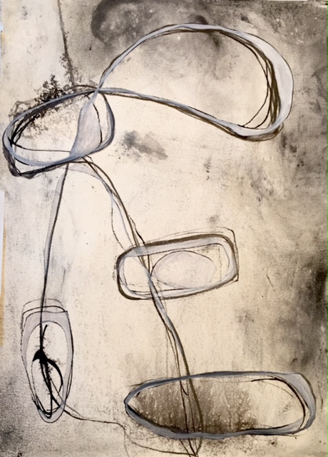
This is the seventh drawing in ink, graphite and pastel. Another Instagram comment, “It looks like you’re drawing on a window”. The tangle of lines and the feeling of observation and looking outward interests me. A goal was to loosen up, to let myself draw whatever I wanted without concern for what anyone might say or think.
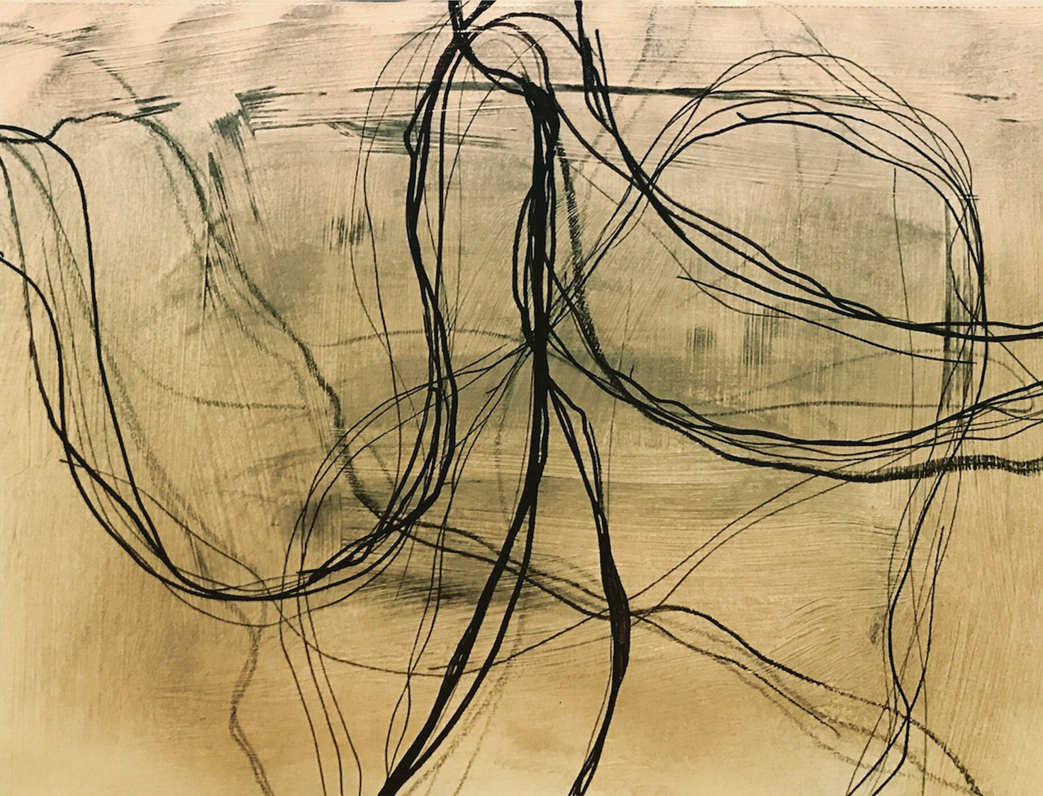
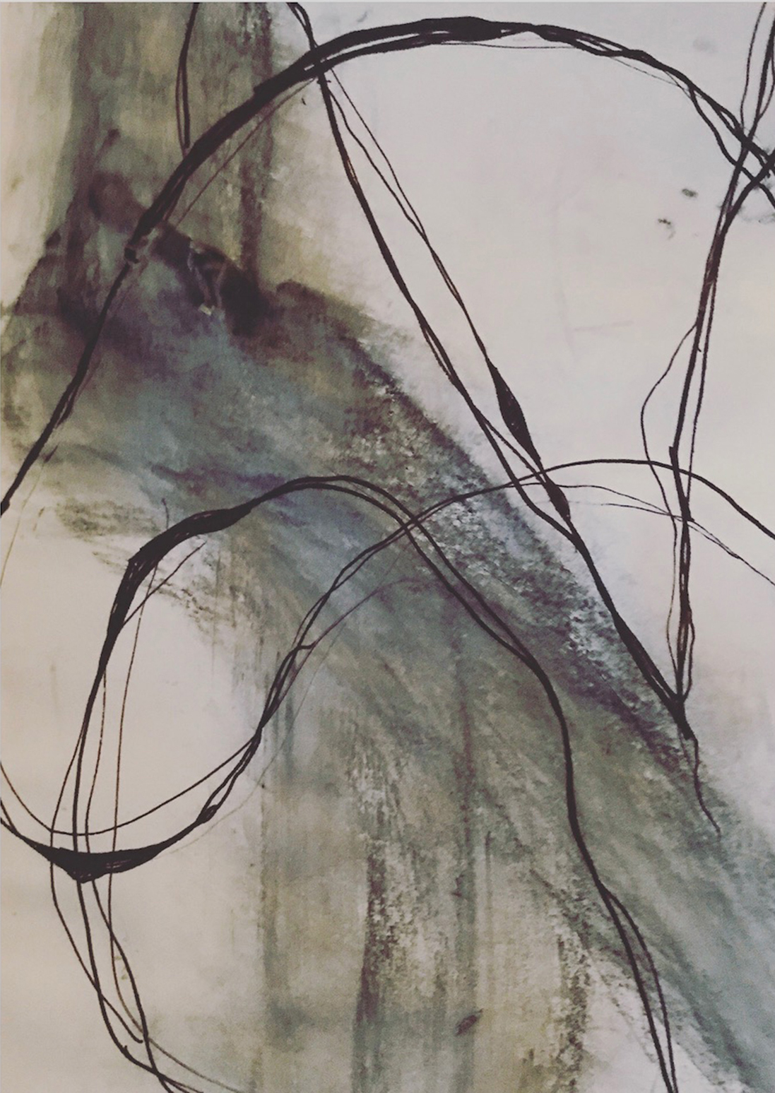
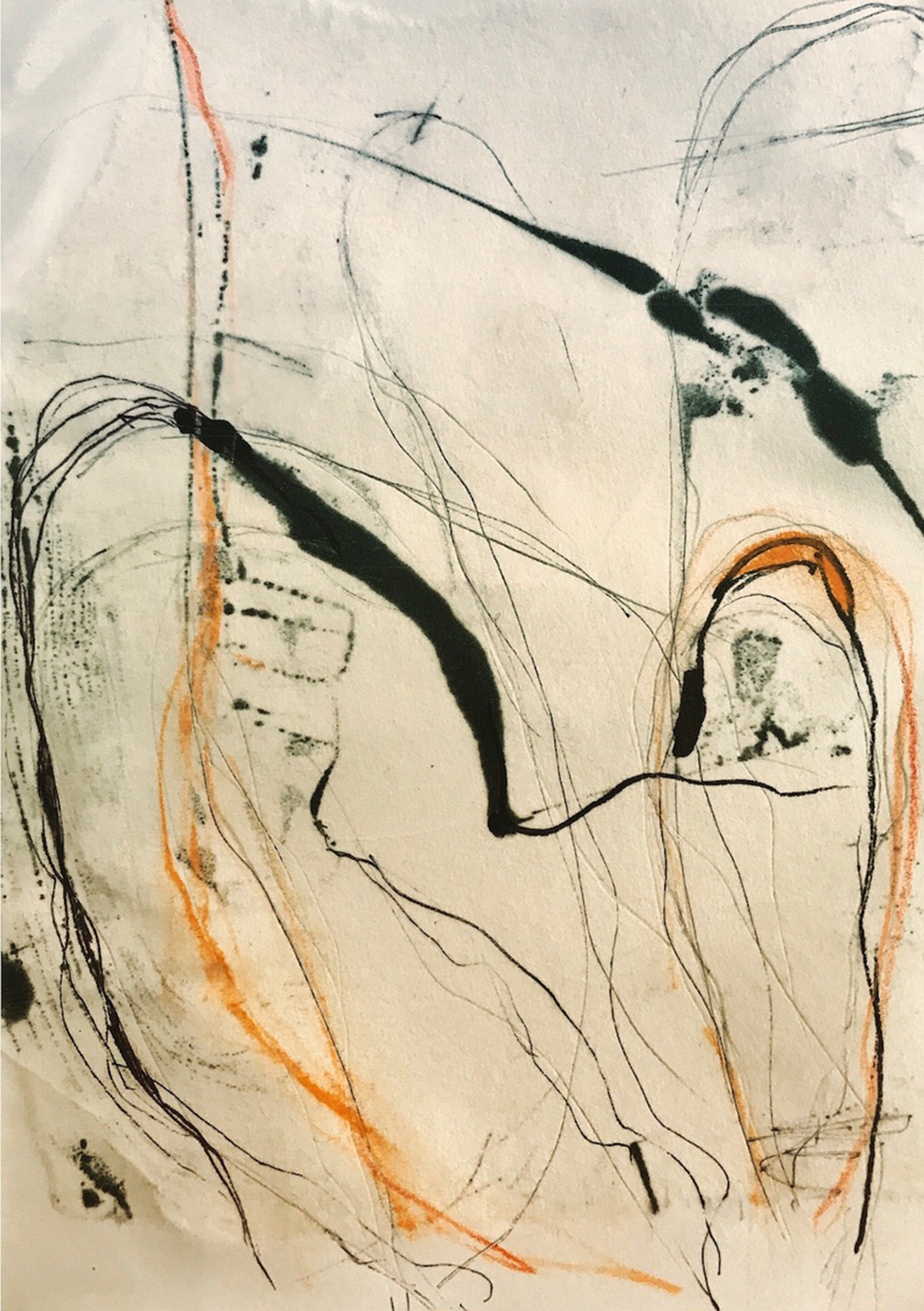
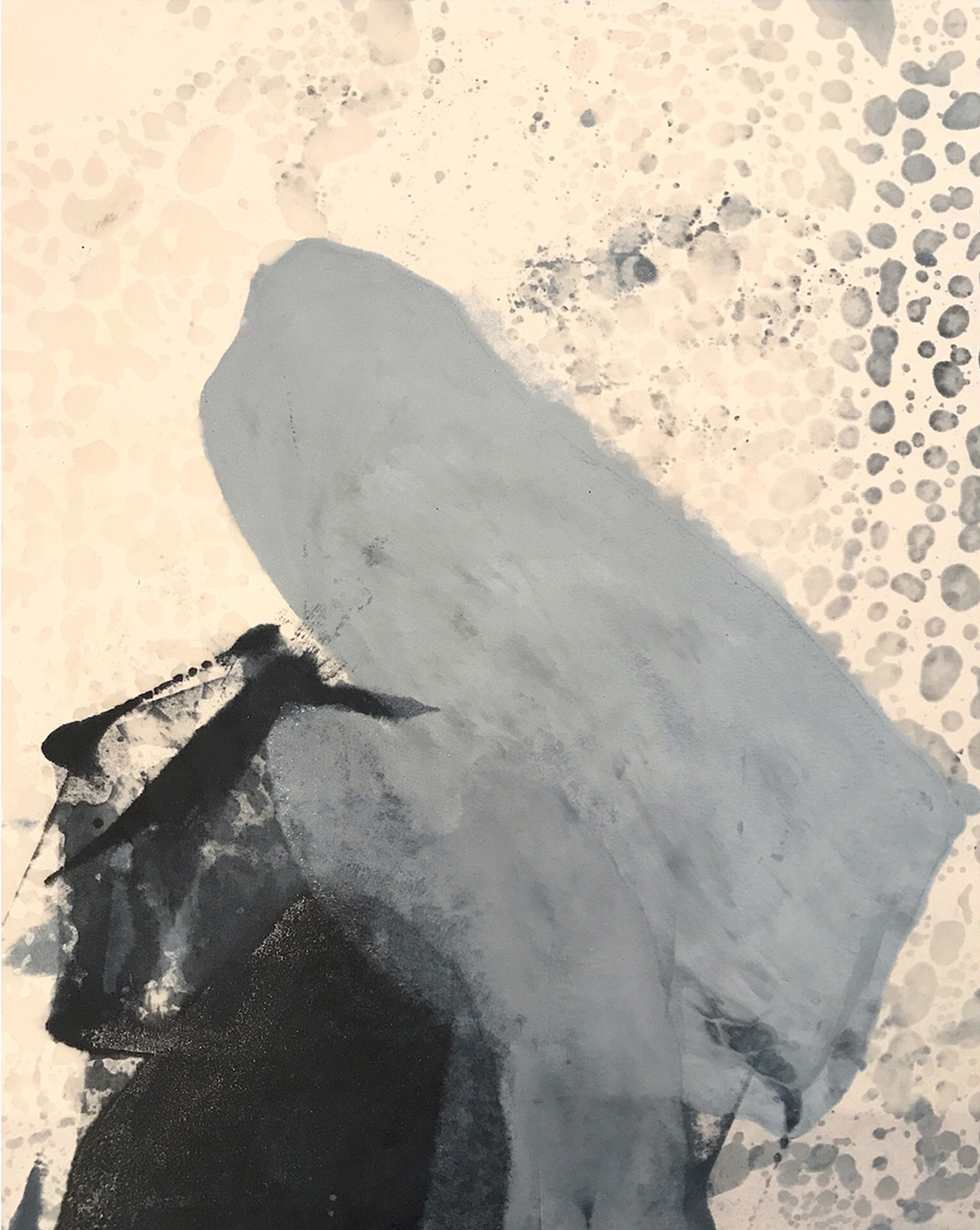
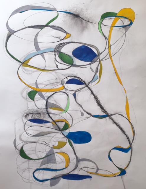
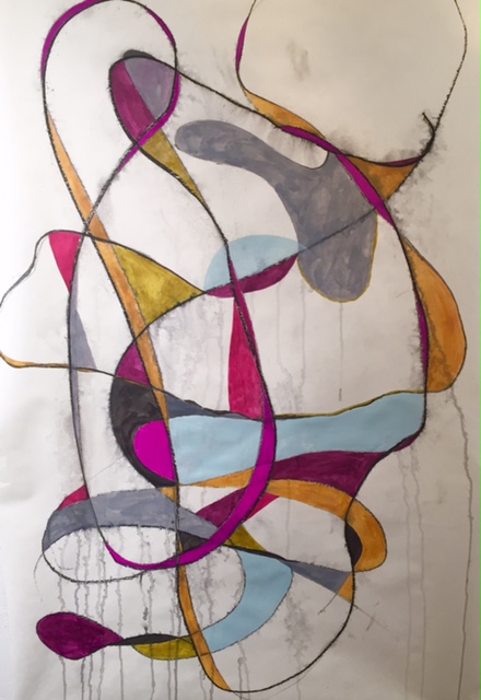
The eighth drawing, also in ink and graphite, contains more curvilinear lines, softer than perfectly straight lines, as they meander in and out of space. Over the course of ten years of caregiving, I began to soften, becoming a more compassionate and patient person.
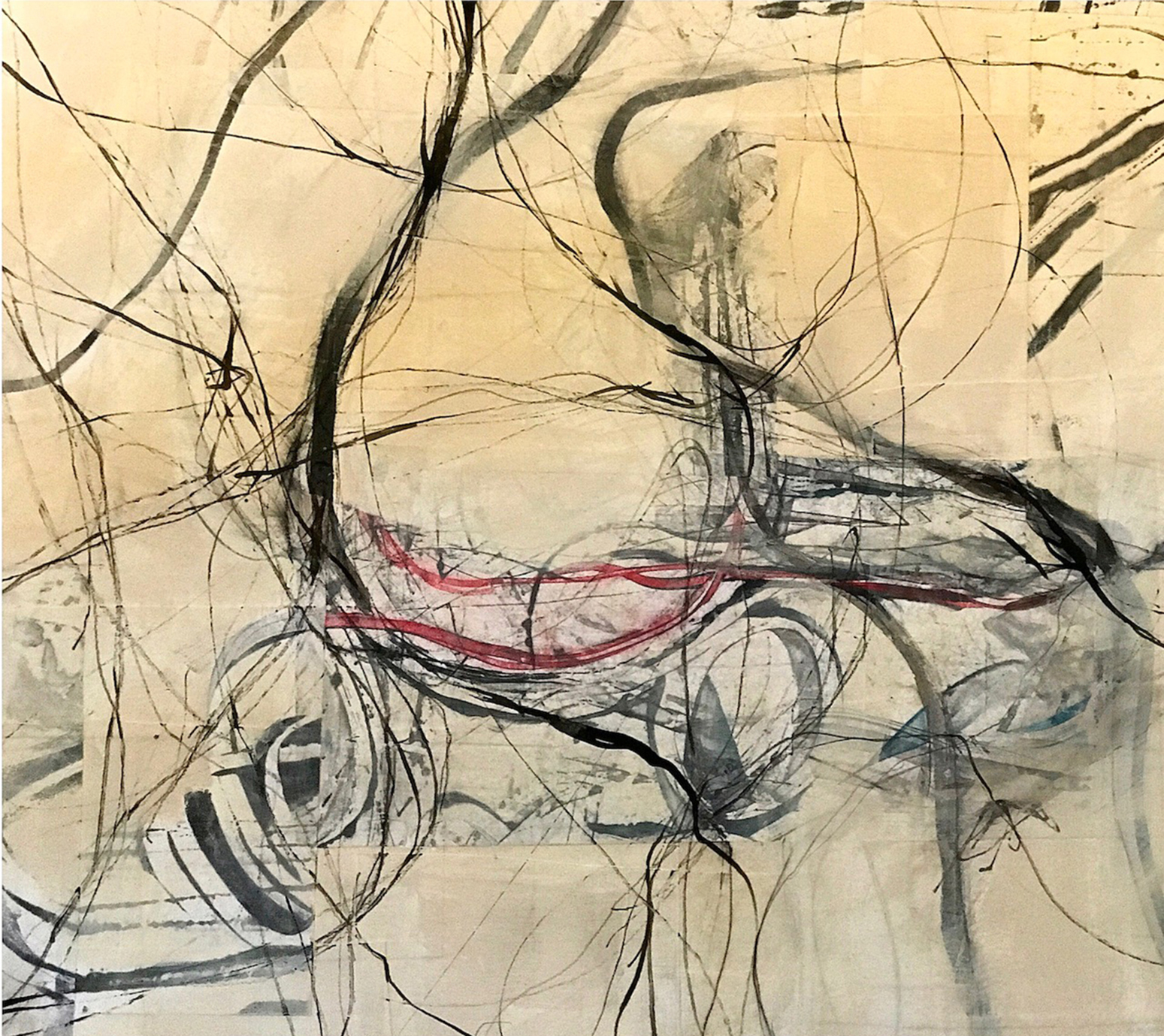
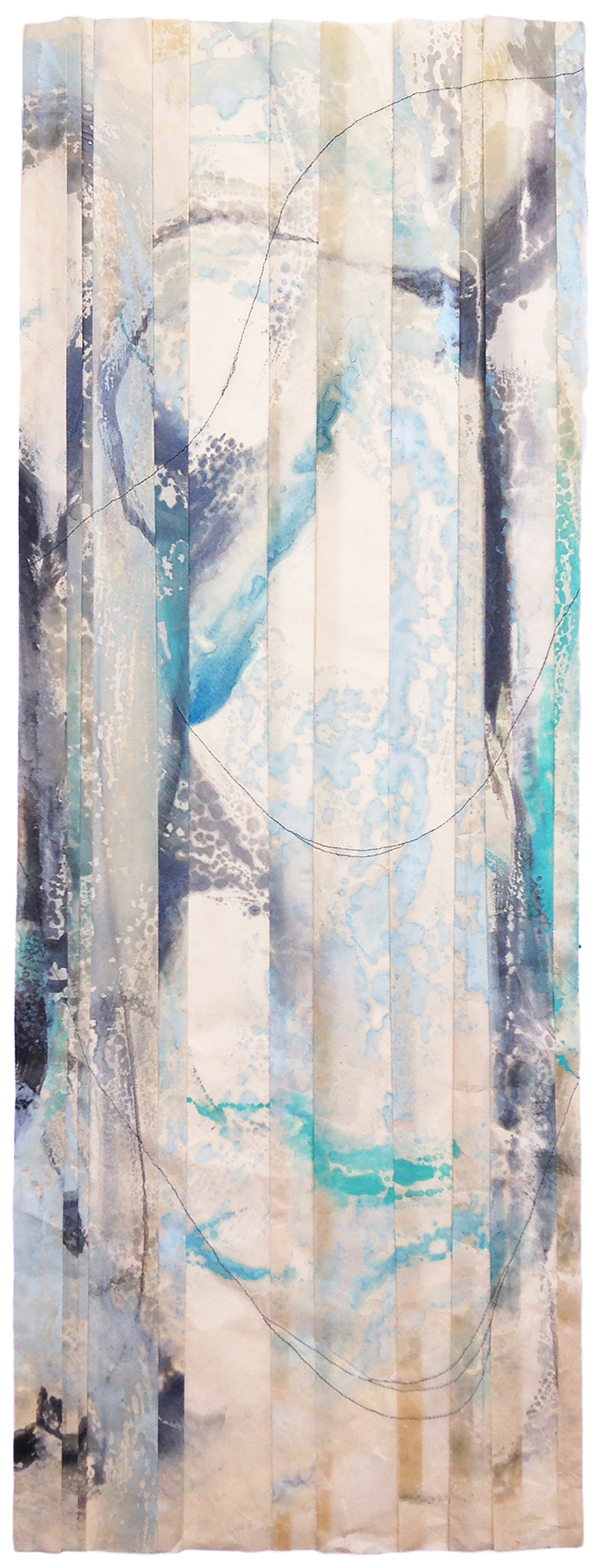
Water of any sort, plays an important part in my creative process. Recently, I found myself mesmerized by a waterfall and body of water in Golden Gate Park, San Francisco. This eleventh drawing, done in different inks and graphite, was an attempt to show the movement of the waterfall connecting with the surface water of the pond.
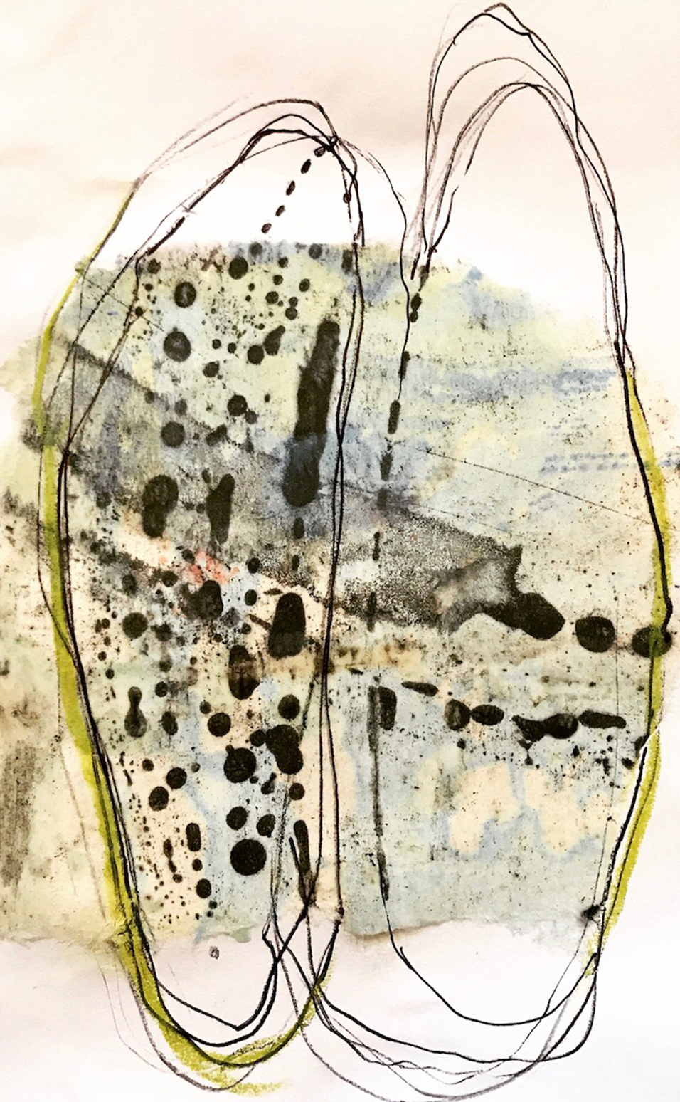
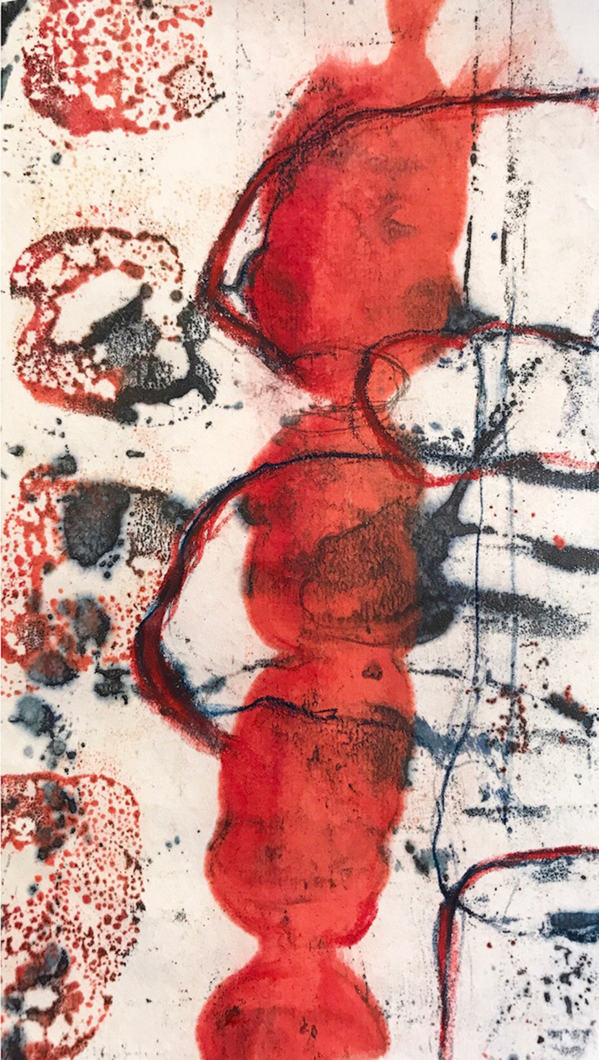
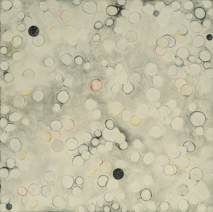
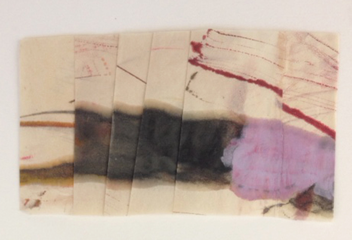
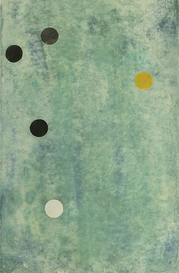
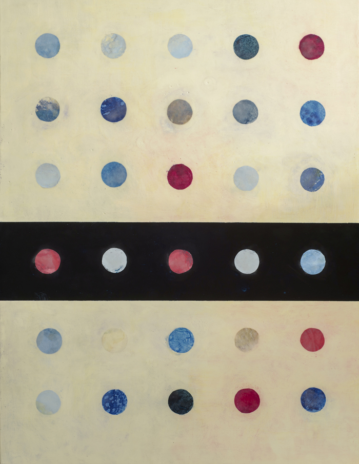
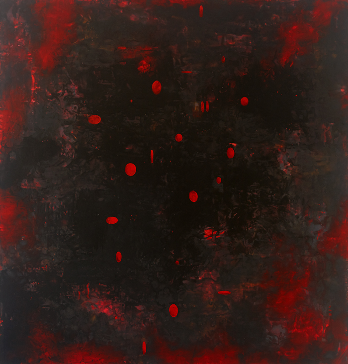
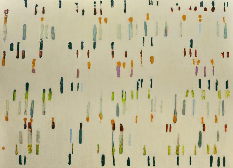
Ovoid shapes and circles have been showing up in my work for over thirty years. Sometimes they are linear, sometimes they are filled in. I used a piece of Japanese paper collage, in addition to ink and crayon. I like the relationship, in this thirteenth drawing, between the two dominant shapes and the tiny black dots, reminding me of my family.
Anne Lamott in Bird for Bird, one of the books I took with me, says, “You can see the underlying essence only when you strip away the busyness and then some surprising connections appear”. Lamott’s book is about writing and being a writer, but I find the parallels to all creative forms, including art, to be striking. In this seventeenth drawing, I love how the torn edge of the collage, intersects with the lines.
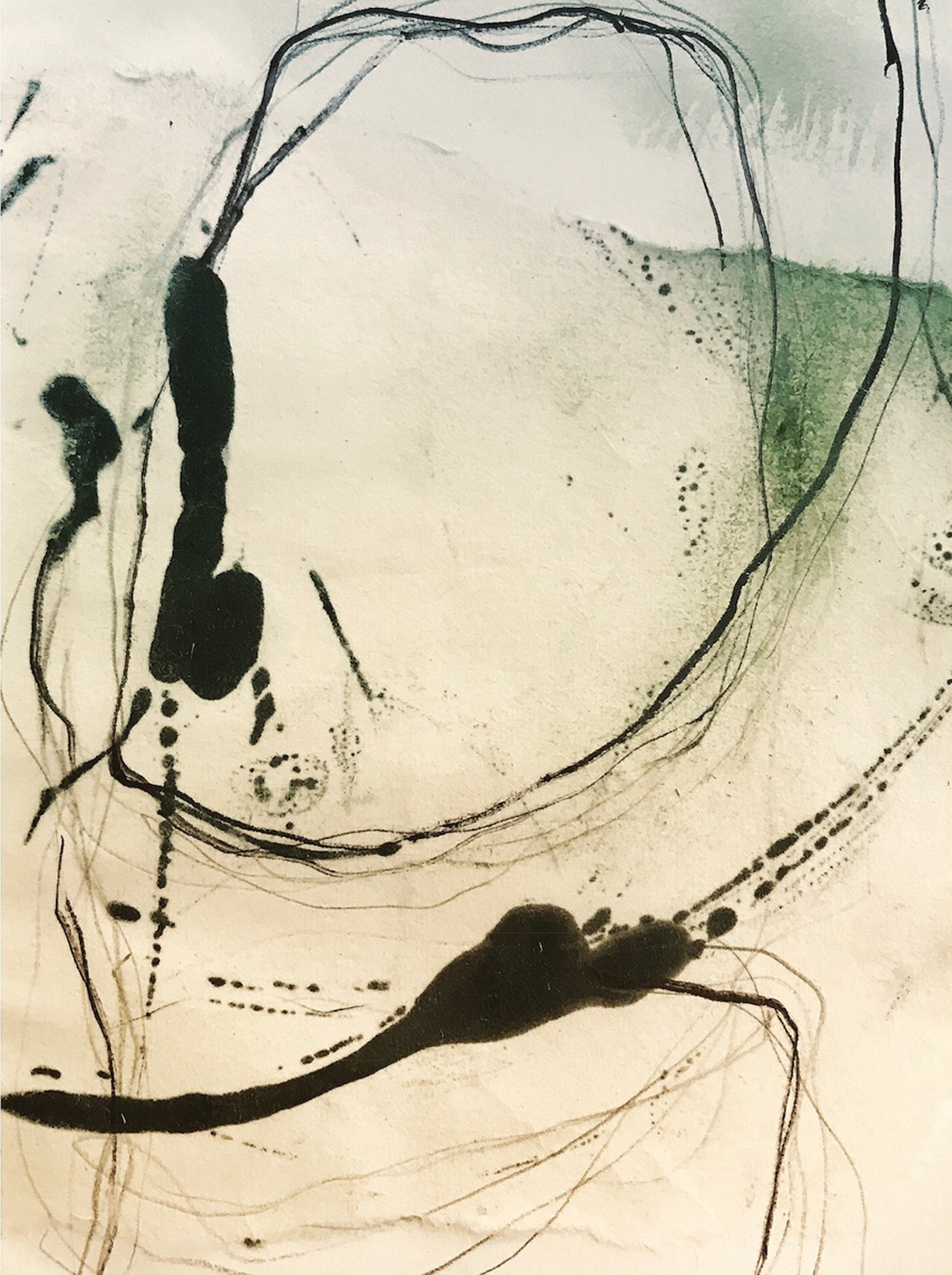
I’m enjoying the simplicity of expression, the negative spaces contrasted with the thicker and thinner line work. Another Lamott quote, “You are lucky to be one of those people who wishes to build sand castles with words (or lines in my case), who is willing to create a place where your imagination can wander”.
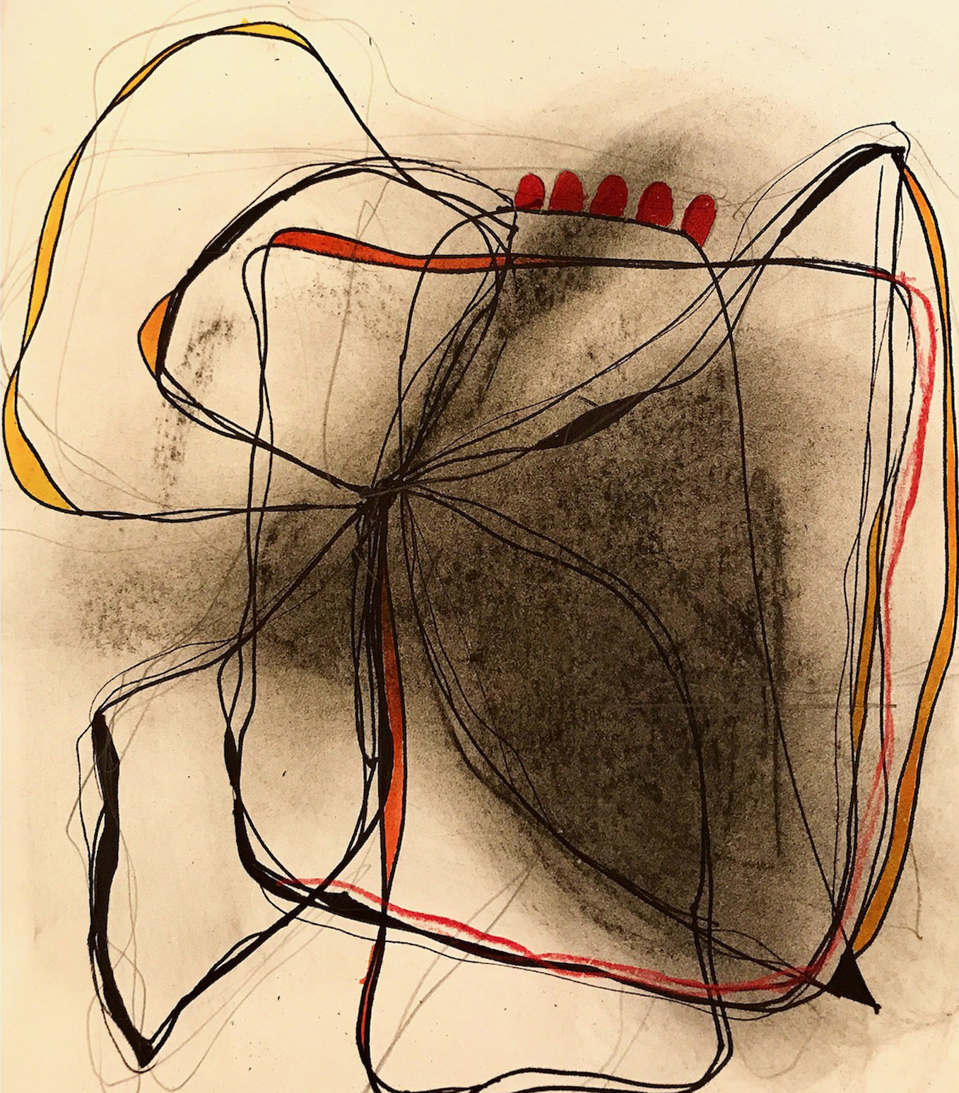
In this nineteenth drawing, I’m combining shapes and lines, but using only two colors. E.L Doctorow said once, “Writing a novel is like driving a car at night. You can see only as far as your headlights, but you can make the whole trip that way. You don’t have to see where you’re going, you don’t have to see your destination or everything you will pass along the way. You just have to see two or three feet ahead of you”. Sometimes I really fixate on my making my work perfect, not trusting the creative process. This is such great advice!
Patterns and rhythm are often present in my work, harkening back to days when I studied music formally. This drawing project has allowed me to embrace all the experiences that define who I am: sometimes geometrically inclined, sometimes not, sometimes bold and sometimes not.
Another Lamott quote that I love, “Try looking at your mind as a wayward puppy that you’re trying to paper train. You don’t drop-kick a puppy into the neighbor’s yard every time it piddles on the floor. You just keep bringing it back to the newspaper”. A different way of looking at the idea of being fully present in what you’re doing.

In the penultimate drawing, collage and ink, I began to feel more playful, while still keeping things simple and not overly busy.
This last one feels like a summation of a few things that are important to me as an artist: bringing beauty into this world while creating evocative work, and simplifying the gesture so the essence is felt. Finding time to sit quietly, to observe, process and create is even more important than before.
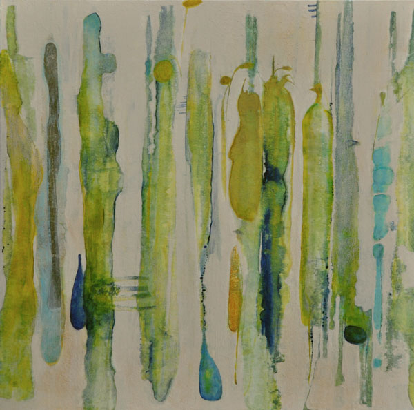
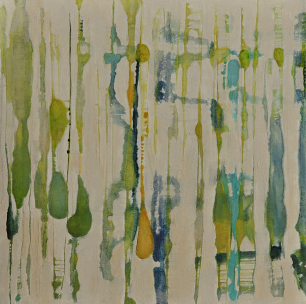
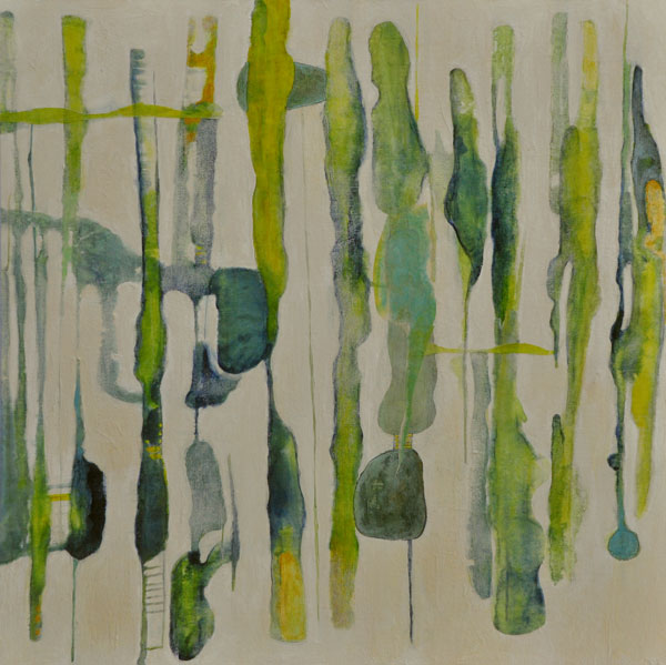
Summer Drawings
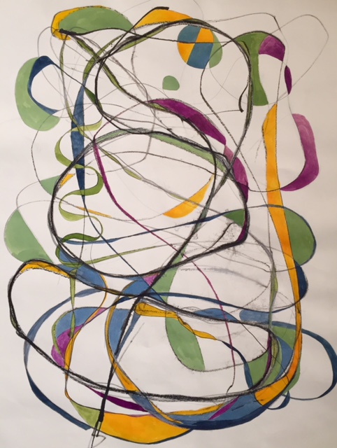
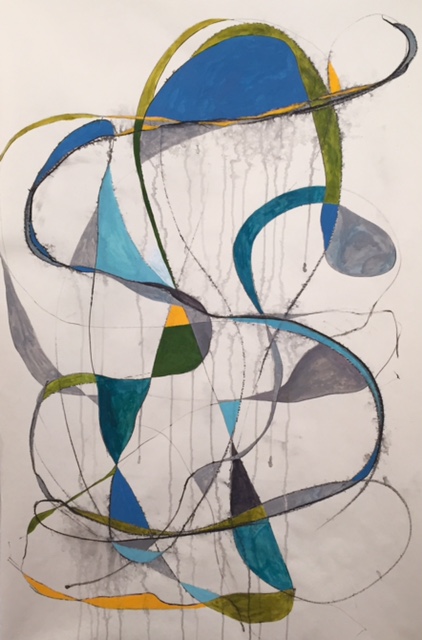
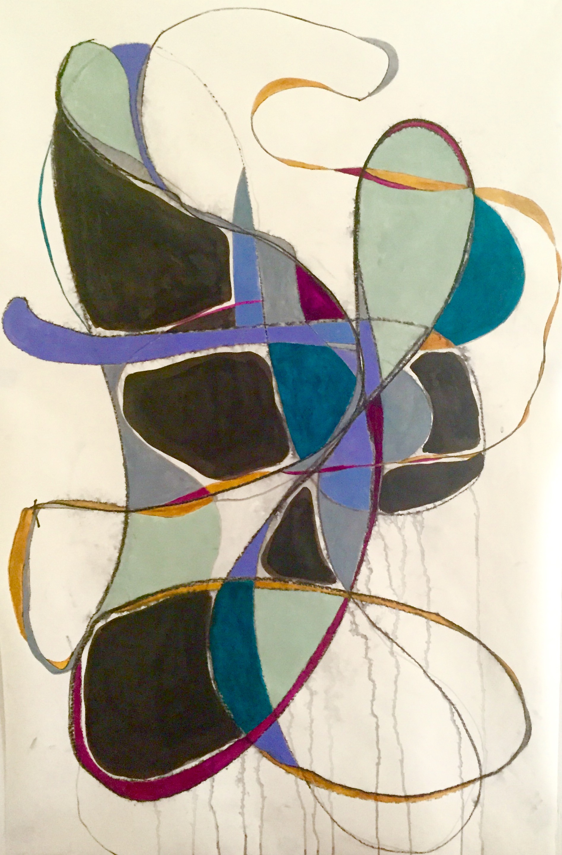
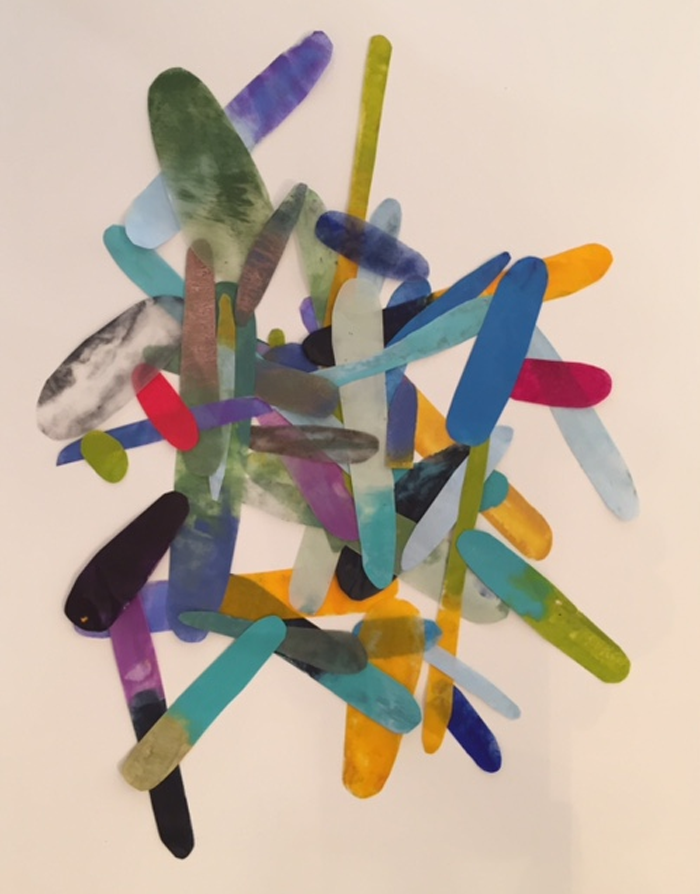
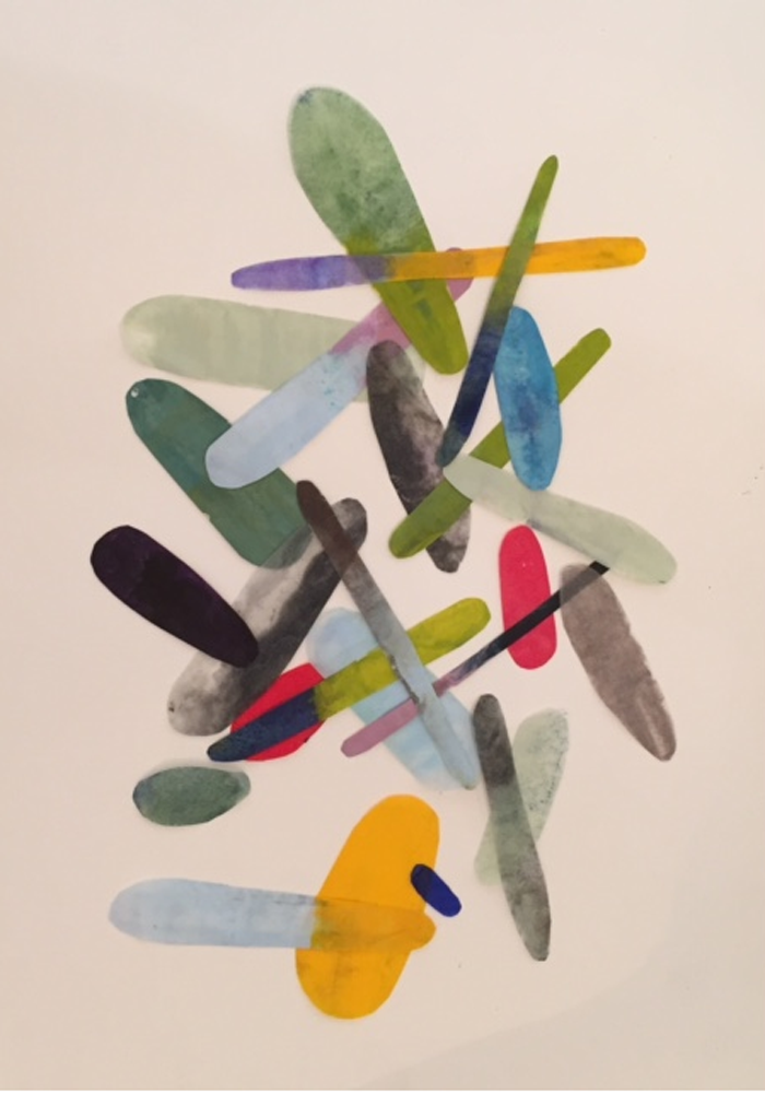
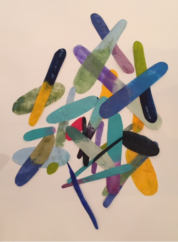
I’ve had a great summer drawing with graphite, ink, conté crayon, gouache and watercolor. The drawings range in size from 26×20 to 46×30. Shown below are a few of my favorites:

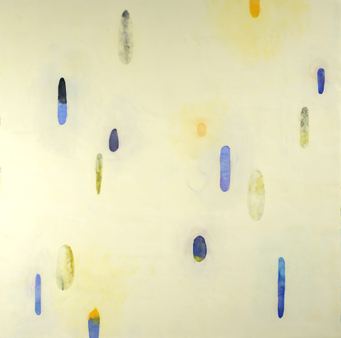
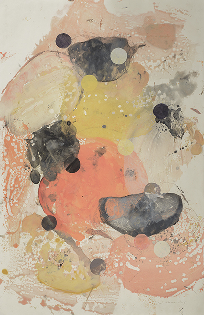
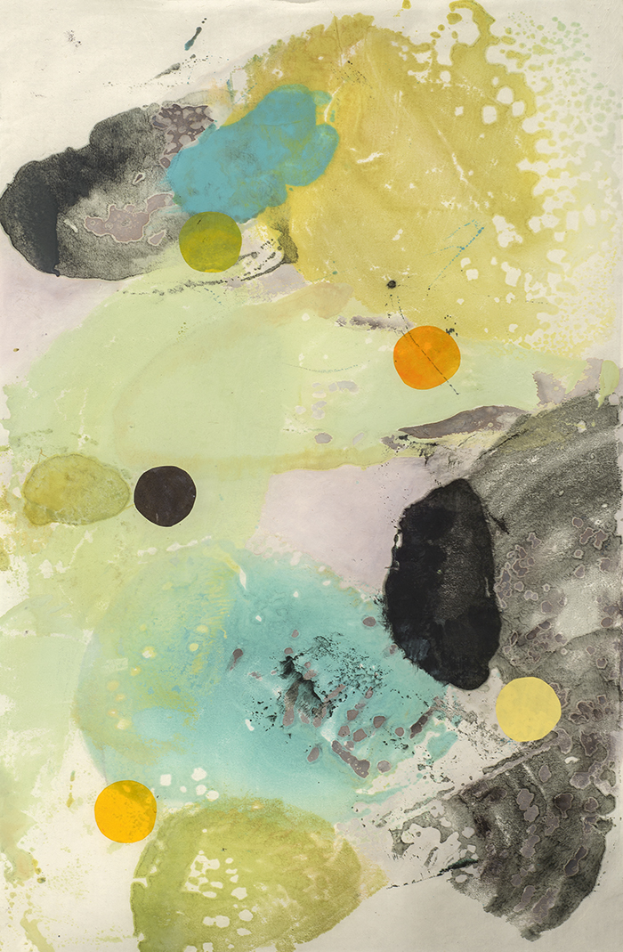
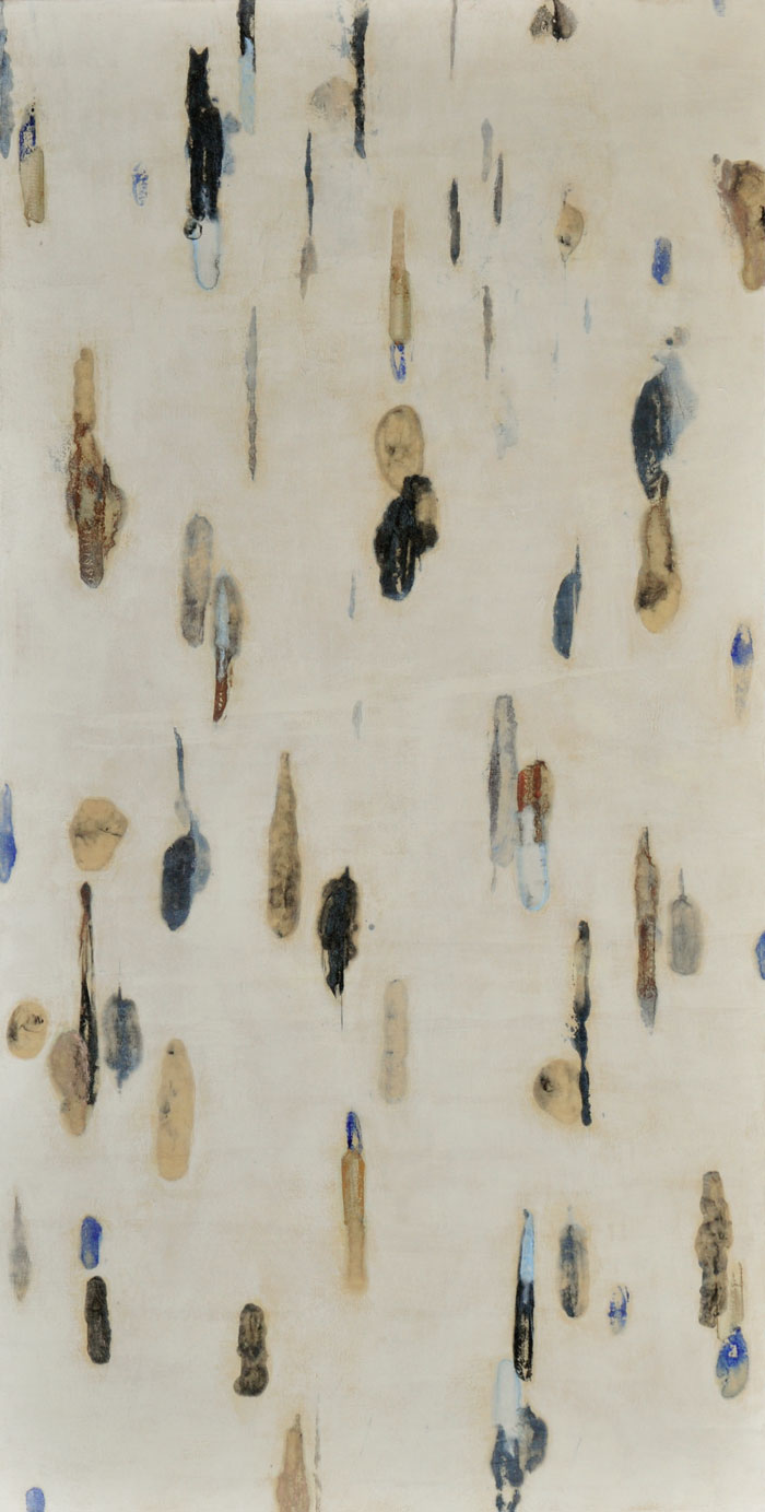
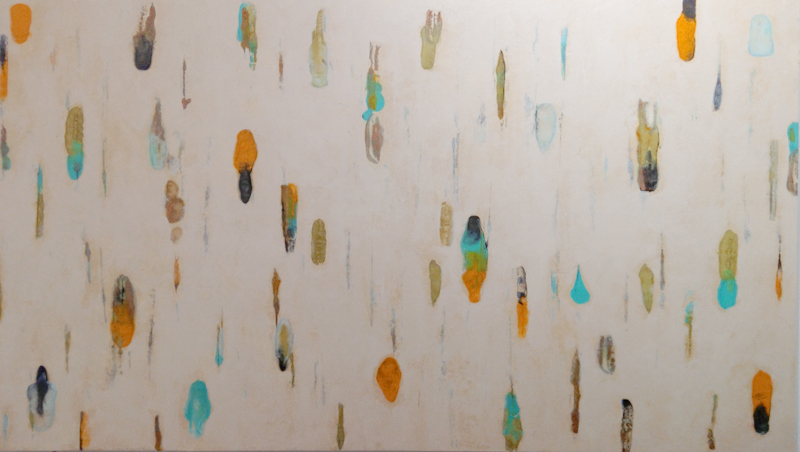
Lumenis: inspired by micro-organisms from the sea
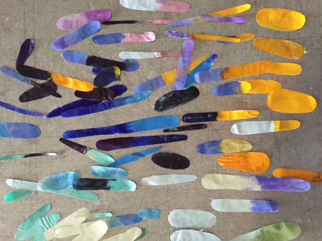
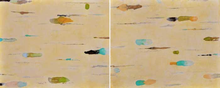
It’s been 4 months since I last posted and I’m continuing to research ideas for my project about medicines from the sea. In doing so, I’ve been playing with shapes and colors of many of the micro-organisms one might find under the microscope.
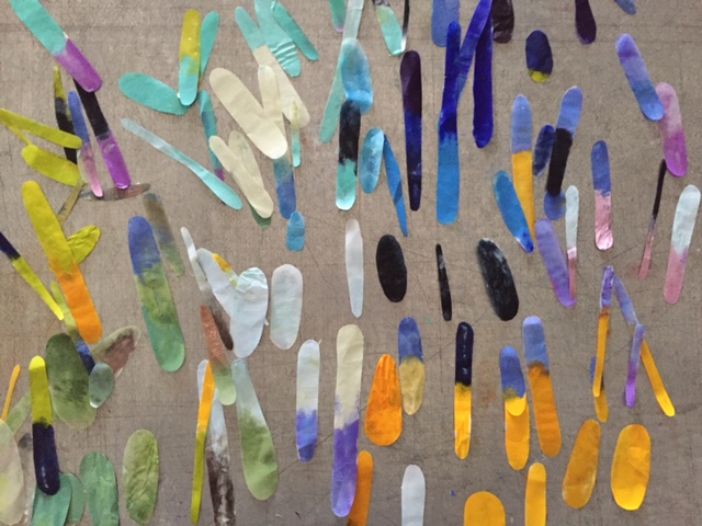
These shapes are washi that’s been hand-dipped in pigmented wax, then hand-cut to create cellular shapes.
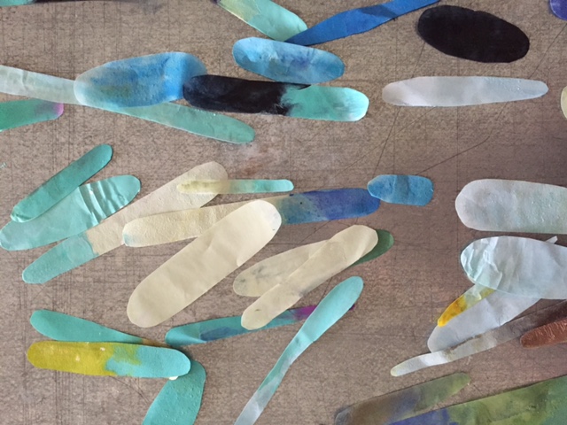
This process, always evolving, hasn’t totally revealed itself yet in terms of where this installation might end up.
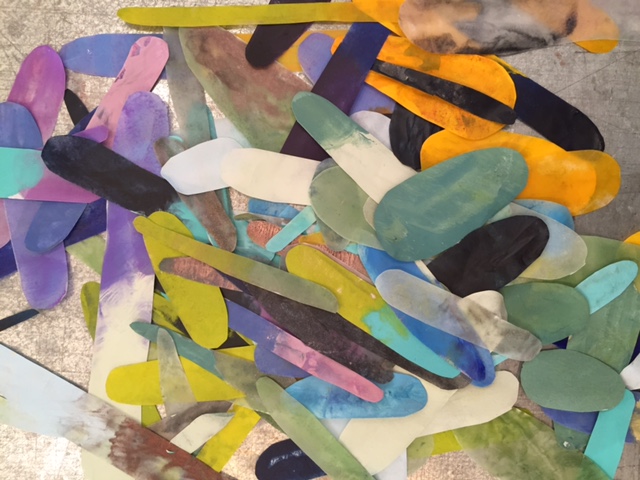
So, I keep working with space, shape and color.
Lumenis Collage 1, mulberry and pigmented wax, 15×11, 2015
Lumenis Collage 2, mulberry and pigmented wax, 15×11, 2015
Lumenis Collage 3, mulberry and pigmented wax, 15×11, 2015
Lumenis 31, pigmented wax, collage and oil on panel, 24×24, 2015
Lumenis 30, pigmented wax, collage and oil on panel.24×24, 2015
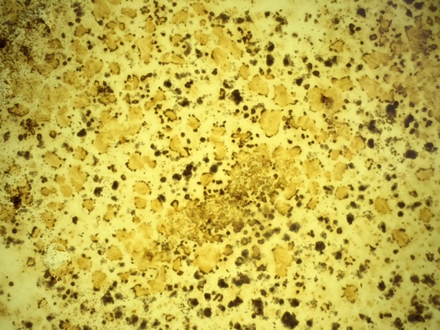
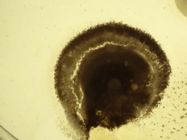
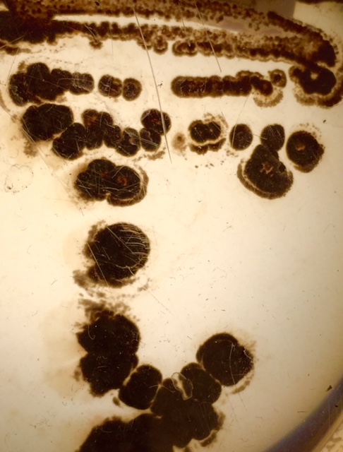
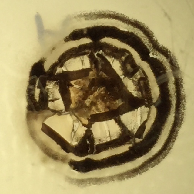
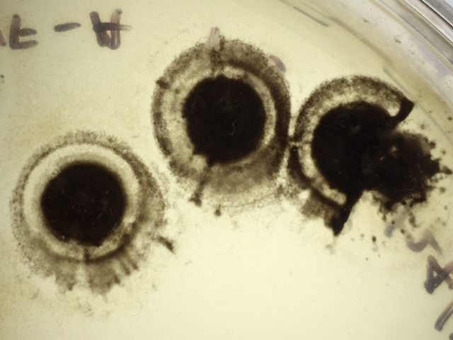
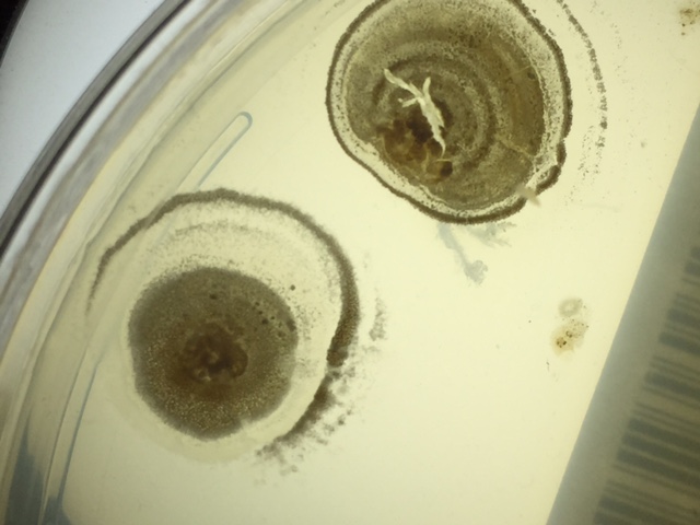
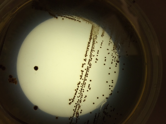
I just began growing my own micro-organisms in Petri dishes – stay tuned for images!
2015 Pollock-Krasner Foundation Grant Project: Medicines from the Sea
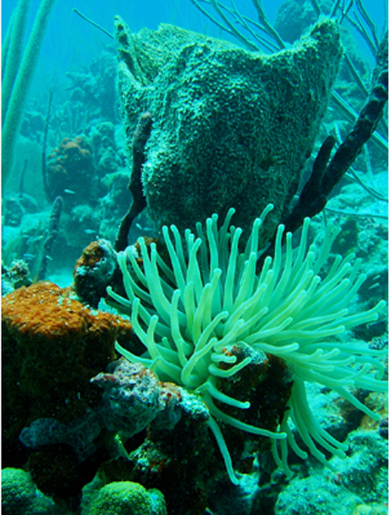
In April of this year, I was honored to receive a Pollock-Krasner Foundation Grant. I knew exactly what I wanted to do with a portion of the award. During the spring of 2014, I was listening to KQED radio and heard an interview with Dr. Roger Linington, a chemistry professor from UC Santa Cruz. He was discussing his research about micro-organisms collected during ocean dives. Roger and his colleagues would bring specimens back to the lab after they were placed in Petri dishes that had been treated with various cells – cancer, malaria, AIDS, etc. They would culture these to see if there was a positive reaction and if so, they would be tested further.
Ocean exploration often leads to new ideas, new theories and discoveries, including new medicines. From slime to sponges, researchers are exploring the ocean’s depths for new medications to treat cancer, bacterial infections, viruses, heart disease, pain, and other ailments.
The seas contain an uncounted number of species of plants and animals. These creatures provide a vast storehouse of chemical compounds unknown on land. An ocean commission report lists chemicals and biological materials from marine organisms now in use or development, including 10 anti-cancer drugs, drugs to fight inflammation, fungus, tuberculosis, HIV, malaria and dengue.
A number of marine creatures have been used successfully in medical research and testing.
A Caribbean sponge has been discovered to generate compounds used in AZT (zidovudine, Retrovir), which is used to fight the AIDS virus. Caribbean gorgonian (a soft coral) produces a group of compounds with anti-inflammatory properties, which are also included in an anti-wrinkle cream. A tentacled aquatic organism, called bryozoan Bugula neritina, yields a compound being tested as a cancer drug. Skates (a flat fish shaped like a kite) have provided clues used in treating vision loss. Corals and mollusks are used to make orthopedic and cosmetic surgical implants. Horseshoe crabs are commonly used to test for bacterial contamination. Microalgae are used in vitamins and other nutritional supplements. Bone grafts from coral skeletons, pain relievers from sea snail venom, and infection-fighting agents from shark skin are all under study.
The list is plentiful even though 95 percent of the ocean has yet to be explored. Exotic, hard-to-reach places, such as deep-sea hot vents and seabed sediments, have barely been documented. However, as advances in ocean exploration and underwater technology open new depths to scientists, the ocean’s potential as a biochemical resource has become more apparent.
To uncover medical mysteries of the deep, NOAA has partnered with “bioprospecting” scientists to find marine organisms with chemical compounds capable of treating human diseases. With NOAA Ship Okeanos Explorer, America’s Ship for Ocean Exploration, experts ashore are connected live to the ship as it maps the ocean and collects ocean specimens, some with potential medical and economic benefits.
With an increasing number of specimens collected from a variety of ocean projects, scientists may find that the ocean could become the biological focus for discovering 21st century medicines.
In the future, marine ecosystems could represent an increasingly important source of medical treatments, nutritional supplements, pesticides, cosmetics, and other commercial products. Drugs from the ocean are without question one of the most promising new directions of marine science.
While my installation project has yet to reveal itself completely, there will be two and three dimensional components, all inspired by these beautiful images of micro-organisms from the sea.
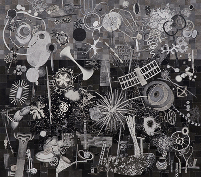
Detail from (r)evolution 28, 2014, encaustic, graphite, oil and collage on panel, 48×40
Please check back for visual updates on this project!
Recent works on paper and paintings from FOLDED and (r)evolution series

FOLDED August 24, pigmented wax and silk thread on Kitakata, 33×35, 2014
FOLDED August 17, pigmented wax and silk thread on Kitakata, 38×32, 2014
FOLDED July 29, pigmented wax and silk thread on Kitakata, 39×27, 2014
FOLDED September 2014, pigmented beeswax and silk thread on Kitakata, 48×19, 2014
(r)evolution 20, pigmented wax, oil and collage on panel, 40×30, 2014
(r)evolution 19, pigmented wax, graphite, oil and collage on panel, 40×40, 2014
(r)evolution 15, pigmented wax, oil and collage on panel, 40×40, 2014
(r)evolution 18, pigmented beeswax, graphite, oil and collage on panel, 40×40, 2014
(r)evolution 21, pigmented beeswax, graphite, oil and collage on panel, 40×30, 2014
GORGEOUS: Art from the Asian Art Museum and SFMOMA in provocative and stimulating new contexts…to confront beauty in some of its most extreme forms.
Last Friday, I had the pleasure of seeing GORGEOUS, an exhibition at the Asian Art Museum in San Francisco. The works shown, from SFMOMA and the Asian Art Museum collections, were mixed, from just okay to very powerful. As the curators mentioned, this exhibition is not about the context or meanings of the objects. The focus is on what the objects look like and how we react to them. What grabbed me the most were the text plaques alongside each piece. The subject of Beauty is one I’ve been exploring and reading about for the last 2 years. While there’s not enough space in a blog to do this subject justice, I’m including a few highlights below. Excerpted texts are from the curators: Allison Harding and Forrest McGill or attributed to the source.
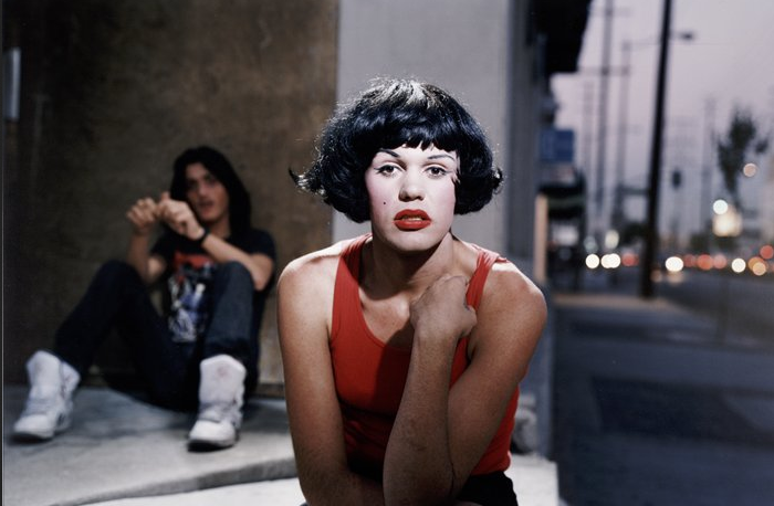
Marilyn, 1990, Philip-Lorca diCorcia, photograph
“The gorgeous challenges the limits of conventional beauty, often approaching the grotesque, abject, overwrought or kitsch. It catches us off guard with an attraction to that other thing, the under belly, where beauty gets messy and unpredictable. Some may feel attracted, others repulsed. We can’t look away. S/he may not be beautiful; s/he is gorgeous.”
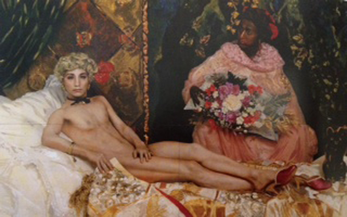
Portrait, 1988, Yasumasa Morimura, Chromogenic print with acrylic paint and gel medium
“Dust, filth, sweat, fractures, debris, remains: the breakdown of perfection is a nagging feature of the gorgeous. Sometimes these breakdowns are accidents of time and nature. Other times they are calculated effects, integral to an object’s creation and importance. In both cases, there is an allure in the imperfections of ideal forms. When we notice these imperfections and find beauty in the breakdown, these artworks might affect us in unexpected ways.”
Chemical and Biological Weapons Proving Ground/Dugway, UT/Distance-42 miles/10.51 am, 2006, Trevor Paglen, Chromogenic print
“The gorgeous is in the eye of the beholder. It is nothing unless you are there to receive it. For some artworks, the full extent of gorgeousness is not immediately seen. It is something you experience through reflection over time.”

Nonsite (Essen Soil and Mirrors), 1969, Robert Smithson, Soil and twelve mirrors
“Beauty is always bizarre. I do not mean to say that it is voluntarily, coldly bizarre…I mean that it always contains a bit of strangeness, not intentional, but unconscious, and it is this strangeness in particular that creates Beauty…Reverse the proposition, and try to conceive of a commonplace beauty!” – Charles Baudelaire
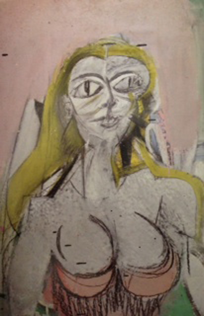
Woman, 1950, Willem de Kooning, Oil on paper
Beauty can be whimsical, fantastical, maybe even mystical…..
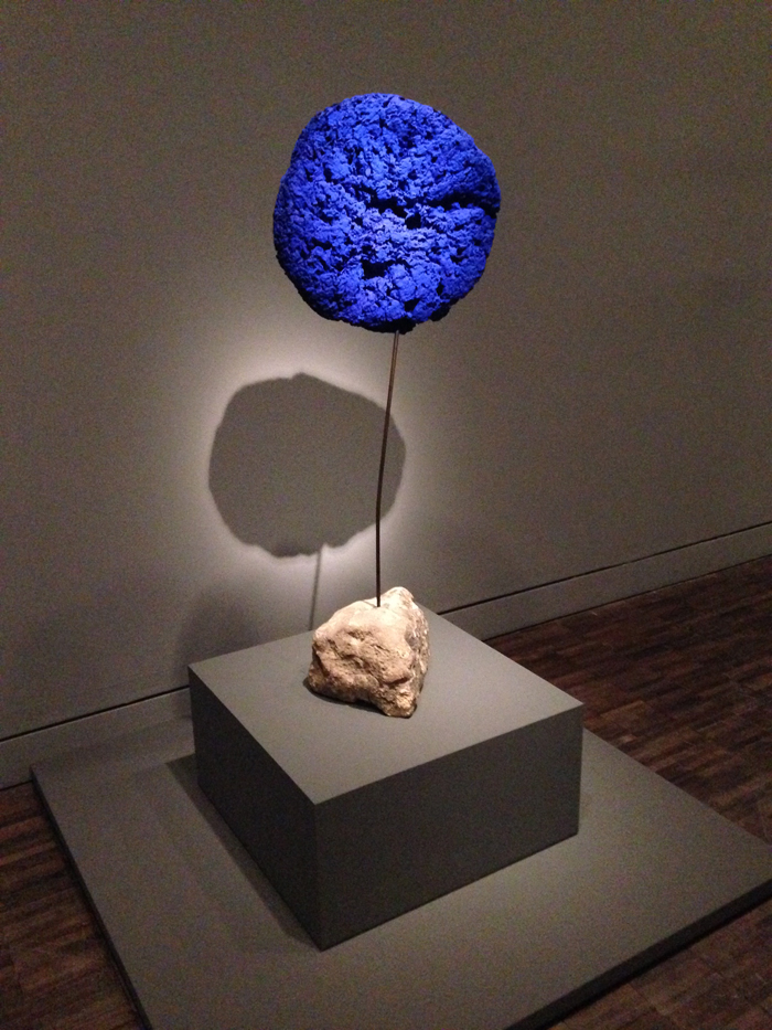
Éponge, 1957, Yves Klein, Resin with pigment on sponge
“If the gorgeous is about extremes, then once is not enough; only more is more. Reiteration emphasizes. It reinforces memory. By fixing a motif in our minds, it allows us to focus on small variations or changes of context. “
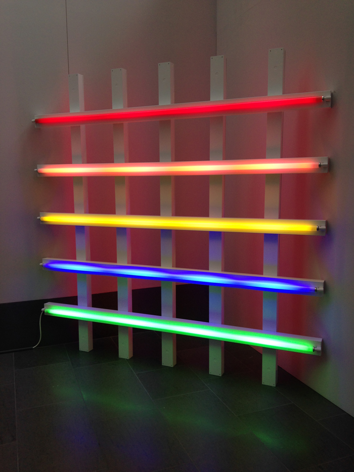
Untitled, (in honor of Leo at the 30th anniversary of his gallery), 1987, Dan Flavin, red, pink, yellow, blue, and green fluorescent light
“The piquing of curiosity is something repetition excels at. How many changes can an artist ring on the related motifs of bull’s-eyes, flower petal arrays and circles of circles?”
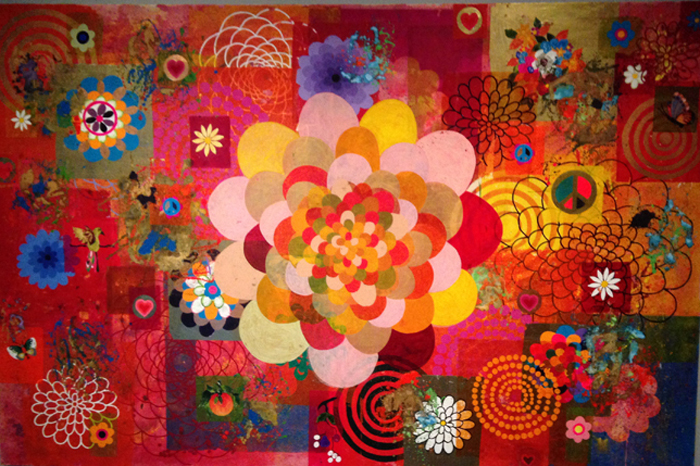
Phebo, 2004, Beatriz Milhazes, Acrylic on canvas
“Happiness is the longing for repetition.” -Milan Kundera
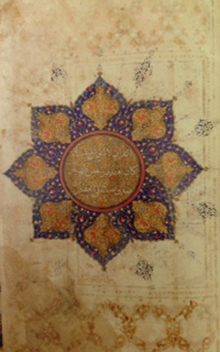
Qur’an, ca 1550, Iran, Gold and colors on paper
“I construct lines and color combinations on a flat surface in order to express general beauty with the utmost awareness.” – Piet Mondrian (1914). Mondrian believed that these things brought him closer to the essence of all things, “as close as possible to the truth.”
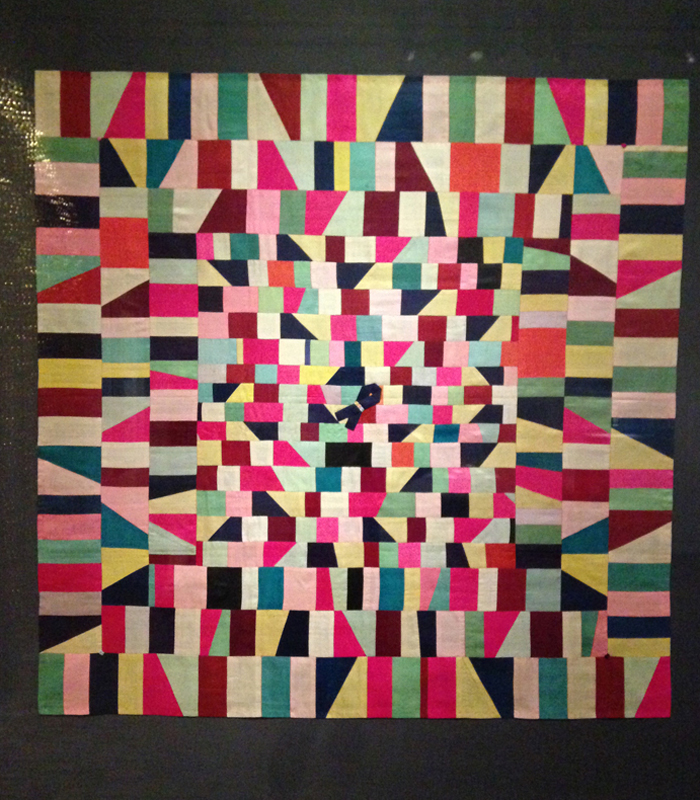
Wrapping cloth (bojagi), 1950-1960, Korea, Patchwork silk (Bojagi are wrapping cloths made from small strips of colored fabric patchworked together with impossible harmony and spontaneity within the borders of a square.)
“Simple, yet elegant. Beautiful in a quiet way.”
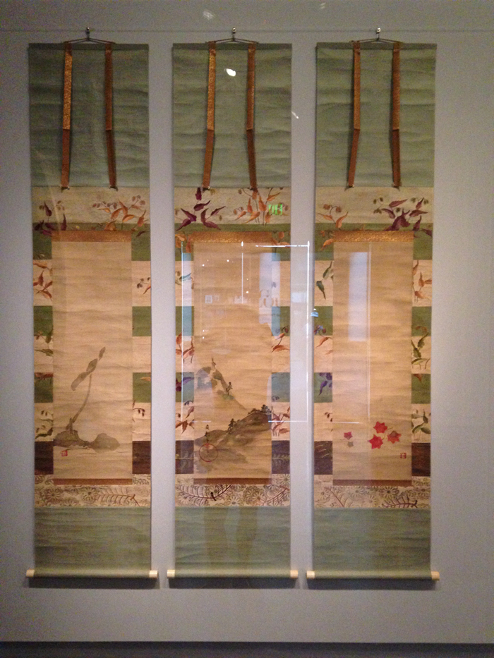
Lotus, deer and maple leaves, 1800-1850, School of Sakai Hoitsu, Set of three hanging scrolls; ink and colors on silk
“Some artworks have a particularly strong effect of provoking our imagination to make new stories or new settings. Gorgeous is about boundaries. Noticing them, brushing up against them, working within them, crossing them, and arguing about them. The formal boundaries of line and color, the social boundaries that shape our responses, and the physical edges of an artwork.”
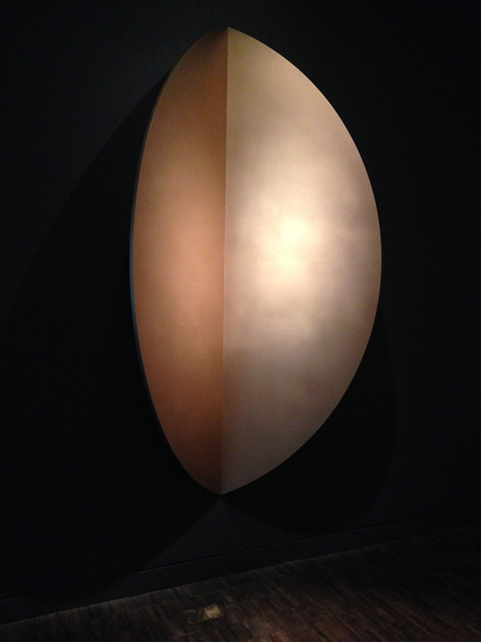
Untitled (Mandorla), 1988, Ellsworth Kelly, Bronze
“Certain artworks come alive in the mind’s eye. Others continue to live there in memory, inspiring a range of imaginative musings or expressing an idea with an accessibility that can elude language, pointing to ideas, implications, even states of being beyond what we see. Sometimes this experience surpasses the artwork itself over time, and that might be the point.”
GORGEOUS, on exhibition at the Asian Art Museum, San Francisco, through September 14, 2014
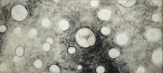
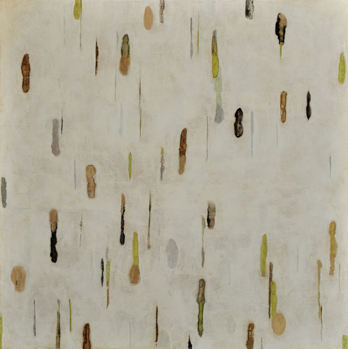
Patterns of Infinity
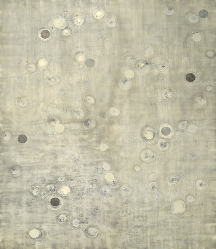
(r)evolution 12, encaustic, collage and oil on panel, 60×48, 2014
Written by Karen Crews Hendon, Curator
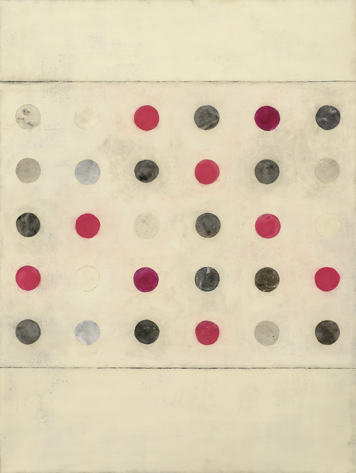
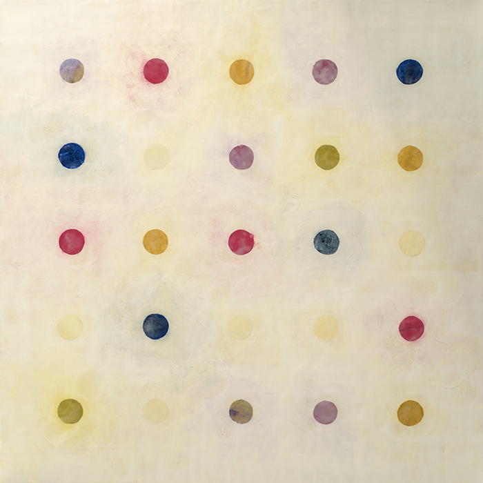
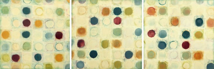
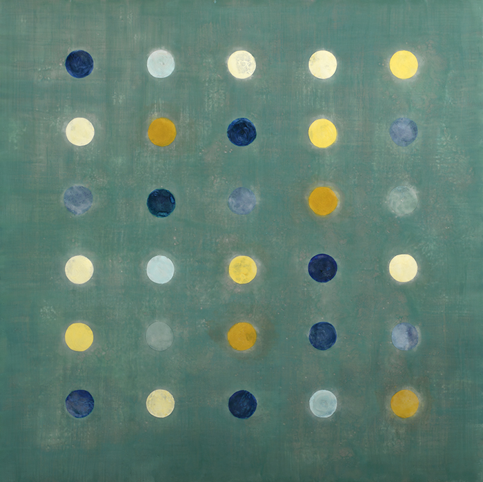
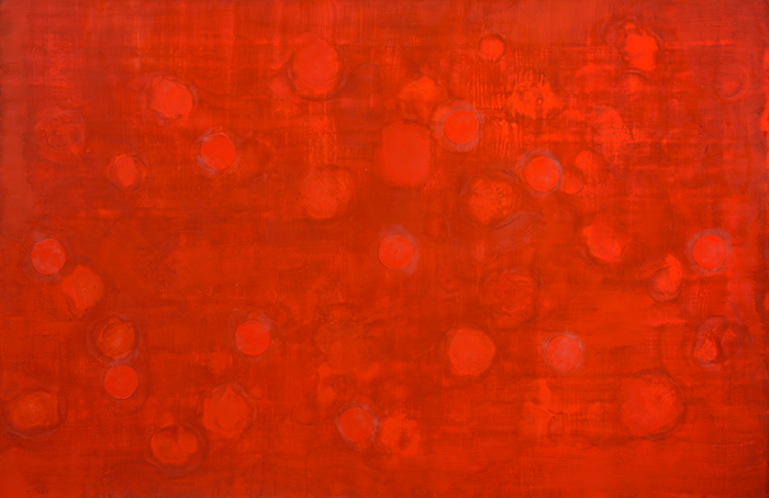
Tracey Adams’ new (r)evolution series is a collection of encaustic on panel works created from 2013-2014. Composed of organic shapes arranged on a linear matrix, Adams explores the intersection of pattern, color, and space.
With distinct rhythm, circular shapes in soft to bold hues appear in succession. Like colorful tabs that fade in and out, they create systematic yet gestural patterns.
Color inspires the mood of these compositions, like subtle timbres or overtones in music. The movement and energy felt in the work pulsate, depending on the unpredictable, yet calculated, intervals between them.
(r)evolution 4, encaustic, collage, and oil on panel, 36×36, 2014
(r)evolution 9, encaustic, collage, and oil on panel, 30×30, 2014
Adams’ passion for music composition, visual perception, and elements found in nature forms a theme at the core of her work. Begun in 2013, (r)evolution, implies a grander variation in which she has opened up and allowed herself a free-flowing perspective.
The artist has named some of her recent paintings Benthic Revolution, 1-8, tapping into the ocean as her primary muse. Her reference to the benthic zone, the lowest level or bottom layer of the ocean, positions the viewer first at the surface.

Benthic Revolution 2, encaustic and collage on Mitsumata, 40×26, 2014
Benthic Revolution 3, encaustic and collage on Mitsumata, 40×26, 2014
Benthic Revolution 8, encaustic and collage on Mitsumata, 32×21
Like peering into the ocean, a continuum of endless patterns, the chance of seeing the same image repeated is unlikely. Her work reveals the subtleties of many layers and dimensions that emerge and take shape, simulating the currents and color pools in nature.
For the past decade, Adams has integrated encaustic, oil, acrylic, graphite, ink, and collage, pushing the boundaries of these materials. In (r)evolution, Adams selected only pigmented beeswax and collage as her medium. This has allowed her to retain the purity she seeks while pursuing new variations.
The evolution of Tracey Adams’ work is cathartic. Comparable to the music of experimental composer John Cage, she is “purposefully playing” which is “an affirmation of life – not an attempt to bring order out of chaos nor to suggest improvements in creation, but simply a way of waking up to the very life we’re living.”
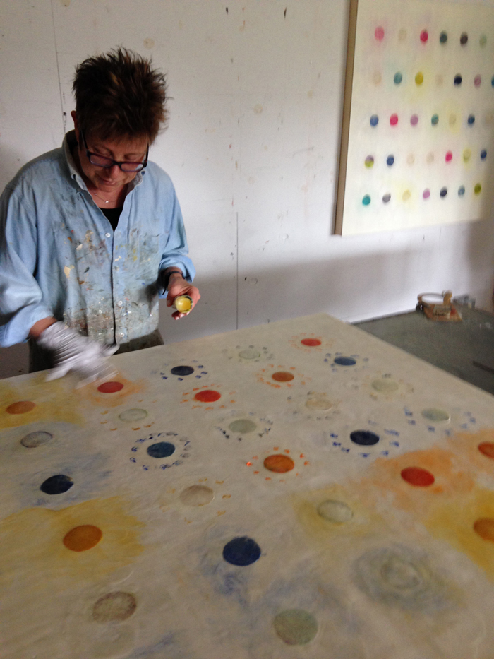
Tracey Adams in her studio
SOLO EXHIBITIONS
Pattern of Infinity
Winfield Gallery, Carmel, CA
July 15 – August 3
Bryant Street Gallery, Palo Alto, CA
July 15 – August 30
Music@Menlo Chamber Music Festival, Atherton, CA
July 18 – August 9
Download Catalogue
Tracey Adams: Patterns of Infinity
GROUP EXHIBITIONS
Outside/Inside
K. Imperial Fine Art, San Francisco, CA
July 15 – August 30
The Circle Game
Tucson Museum of Art, Tucson, AZ
February 22 – September 7
Swept Away
Hunterdon Art Museum, Clinton, NJ
May 18 – September 7
SHIFT: Five Decades of Contemporary California Painting
Monterey Museum of Art, Monterey CA
May 1 – September 22
ARTIST TALKS
Music@Menlo
Artist Talk with Cathy Kimball, Executive Director, San Jose Institute of Contemporary Art
July 29
SHIFT: Five Decades of Contemporary California Painting
Artist Talk with Karen Crews Hendon, Chief Curator, Monterey Museum of Art
August 7
Folded
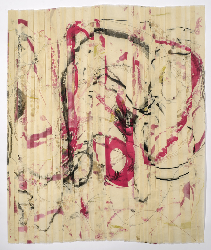
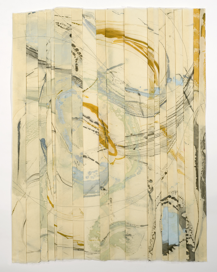
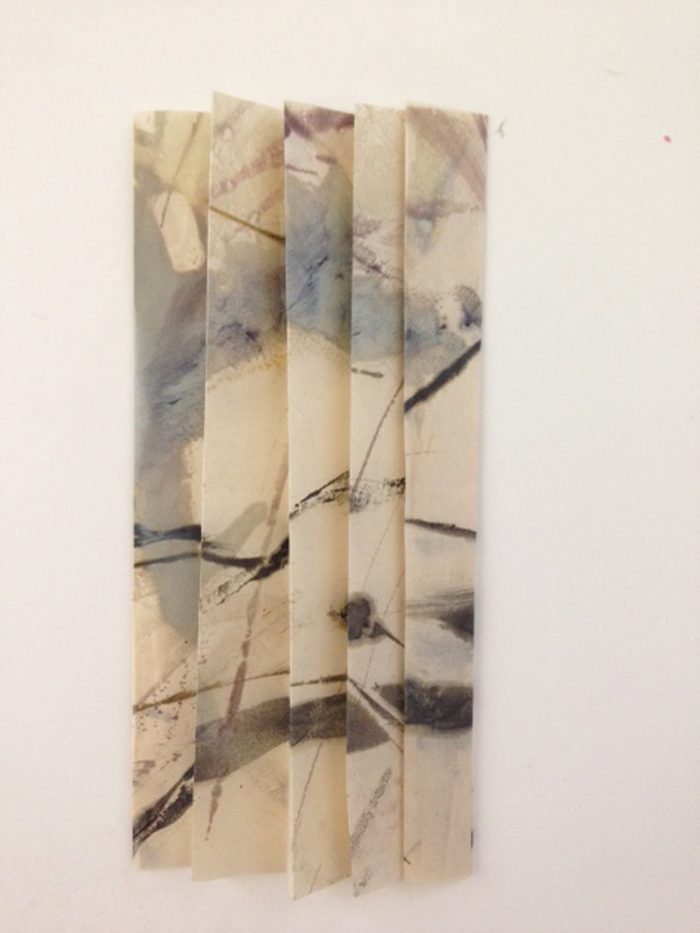
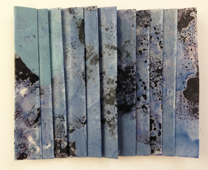
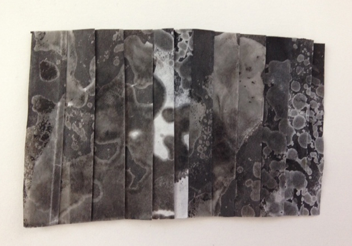
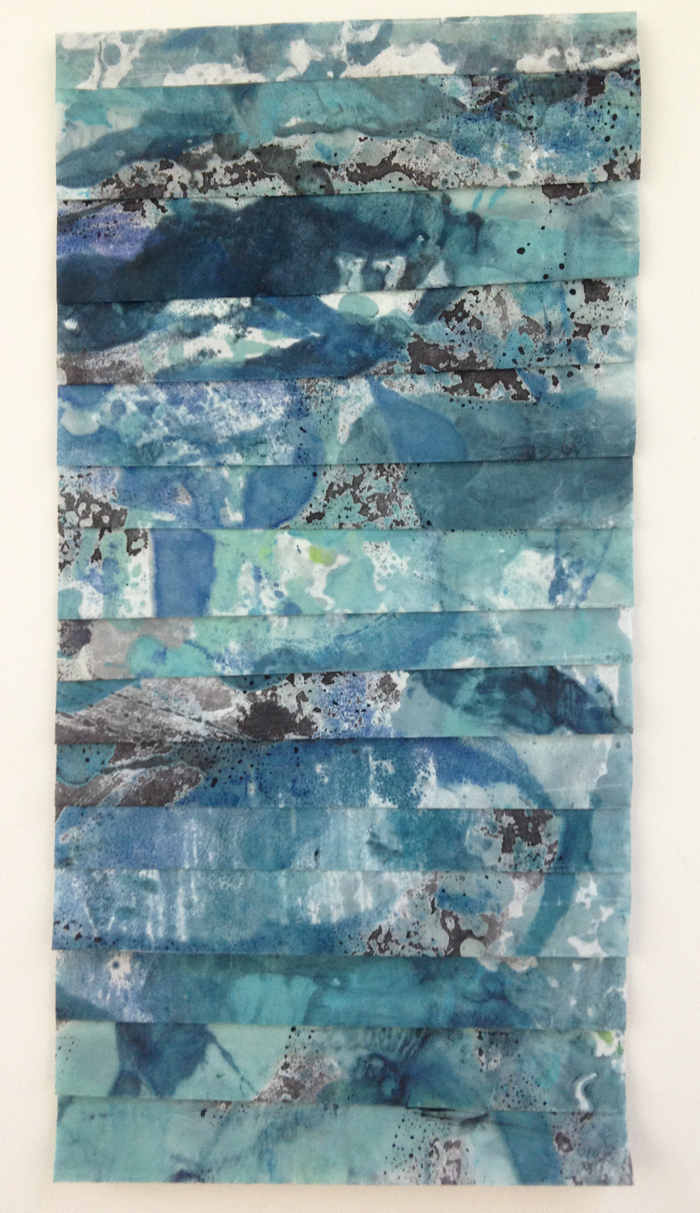
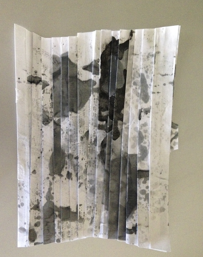
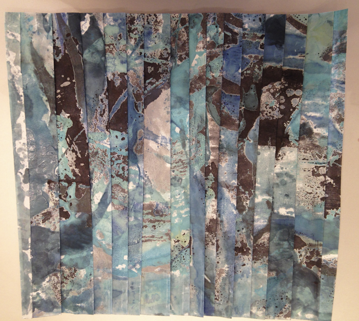
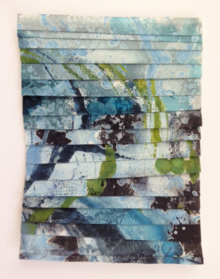
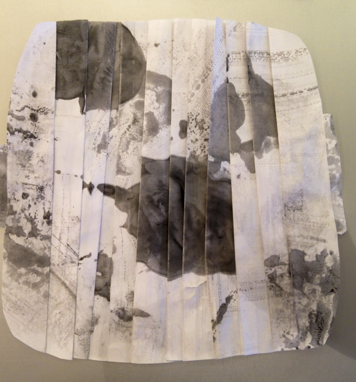
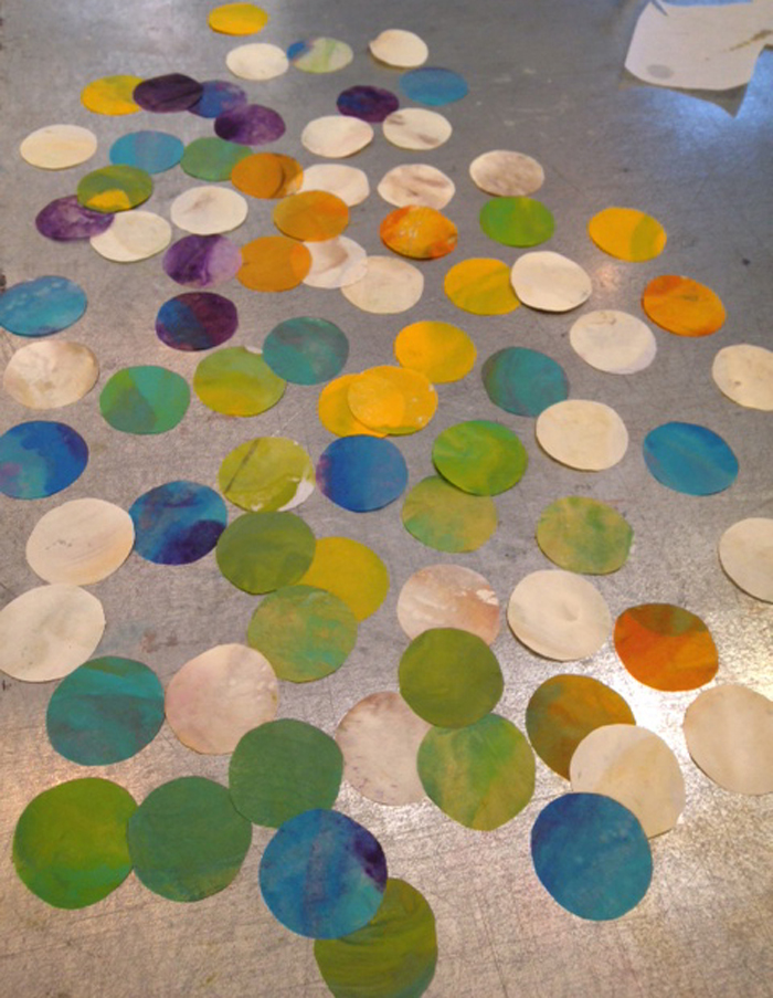
My earliest childhood memories are of Helen Ishi, my father’s business partner. Japanese culture is about sharing and generosity with others. When Helen would visit, she would bring little things for me to play with: small Japanese dolls and toys and my favorite, origami. I loved the bright colors and papers that could be folded and fashioned into animals and other shapes. I’ve always loved the texture and look of paper, especially Japanese paper. I think that’s why I studied printmaking in high school and college – initially woodcuts, then drypoint and soft ground etching, and now encaustic monotype. During the last 7 years my focus has been on the encaustic monotype and the variety of ways I can use it in my work: collage, mounted on panels and painted with acrylic or encaustic paint. Now, I fold them into shapes, sometimes trimming to reshape. Folding alters the painted imagery and yields something quite different from the original image. Lately, my favorite time of the day has been when I make the day’s folded piece.
My new series, Folded, is a way of representing time spent in the studio every day through the use of folds. Each piece contains a certain number of folds that correspond to the day of the month. For example, the piece made on June 14 has 14 folds. The folds have different widths, corresponding to a predetermined calculation I make for each piece. The papers used in these pieces are fragments of encaustic monotypes created previously on Japanese papers; the monotypes were made relatively close to the same time as the day the folded piece was made.
This project developed as my other collage projects have – out of a need to break away from whatever painting or show I was working on; the goal being to loosen up and have some fun in a less important and time-consuming way. I set certain parameters for myself: maximum time spent on each folded piece would be an hour or less and no piece would be larger than 12″x12″. Many of the pieces made duirng this first month, June, are smaller. Collage has always been my default for those frustrating and trying moments in the studio and in my life. It contains the perfect balance of intention and chance.
June 5, 2014
June 10, 2014
June 12, 2014
June 14, 2014
June 15, 2014
June 16, 2014
June 17, 2014
June 11, 2014
June 6, 2014
Indeterminacy
I typically work on a continuum with organic images at one end and geometric shapes at the other. Sometimes I create work that is serialized, based on the repetition of shapes and measurement of the intervals between them. At other times, I improvise along the line of indeterminacy-composer John Cage’s principle of random, unfixed occurrences.
I began working on the series (r)evolution in December 2013, after I was invited to serve as the 2014 Visual Artist for the Music at Menlo Chamber Music Festival and Institute in Atherton, California. Images from my older series, Revolution, were selected to appear on the cover of the concert booklet, the preview flyer and a poster; and an invitation was extended for an exhibition. Intrigued, yet feeling somewhat stymied by the directors’ choice of my older series, I began to consider different possibilities involving the circular images that appear in Revolution.
Revolution 34, encaustic and monoprint on 3 panels, 15×45, 2008
Five paintings later (see images in the previous blog), I felt the need to shake up and loosen my approach. I turned to my hot box and began moving around hot pigmented wax in a delightfully freeing, satisfying way. The results of this experiment proved to be somewhat unpredictable-exactly what I was craving! I discovered I had created two bodies of work: one serialized, using repetitive shapes and rhythms; the other, indeterminate using organic and gestural forms loosely based on circular shapes. Next, I wanted to integrate the two bodies of work. Even though the shapes were more amorphous, I knew it would be possible to weave the circular shapes into this new framework.
Benthic Revolution 3, encaustic on Mitsumata, 40×26, 2014
Benthic Revolution 2, encaustic on Mitsumata, 40×26, 2014
Benthic Revolution 1, encaustic on Mitsumata, 40×26, 2014
Benthic Revolution 6, encaustic on Mitsumata, 32×21, 2014
Benthic Revolution 4, encaustic on Mitsumata, 32×21, 2014
Benthic Revolution 5, encaustic on Mitsumata, 32×21, 2014
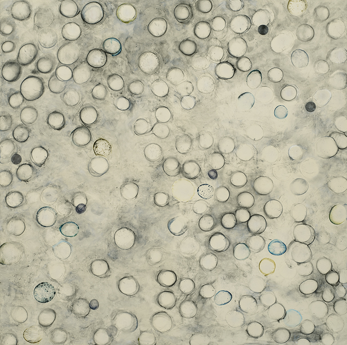
As in my previous work, these pieces are built on a grid. Sometimes my grids are explicit, while at other times they are implicit. My current work uses circles on a random and less obvious grid, creating an ambiguity between figure and ground. These are my first attempts at experimenting with possible outcomes from integrating the serial and indeterminate, and geometric with organic.
(r)evolution: coming full circle
Last October, I was invited to be the 2014 Visual Artist for the Music at Menlo Chamber Music Festival and Institute, a three week event occurring this summer in Atherton, California. It’s is a very exciting time for me, given that music and art are two of the most important things in my life. The founding directors of Music at Menlo, David Finckel and Wu Han, also members of the Emerson String Quartet, chose my Revolution series (2005-2008) to represent this year’s promotional materials and to be exhibited during the event. After experimenting with different ideas, I decided to revisit this series to see what creative possibilities still exist. It is still in the early stages, but four paintings have been completed and three more are underway.

(r)evolution 1, encaustic, collage and oil on panel, 40×40, 2014

(r)evolution 2, encaustic, collage and oil on panel, 40×40, 2014

(r)evolution 3, encaustic, collage and oil on panel, 40×40, 2014

(r)evolution 4, encaustic, collage, oil on panel, 36×36, 2014
(r)evolution 5, encaustic, collage, and oil on panel, 40×30, 2014
(r)evolution 6, encaustic, collage and oil on panel, 36×36, 2014
(r)evolution 7, encaustic, collage and oil on panel, 30×40, 2014
Artist Statement: When printmaking and painting, I work in series by creating an initial motif and then exploring permutations of the theme using color, pattern, line and shape. Influenced and inspired by my study of music theory, I am drawn to the intersections of music, art and math. My process includes repeating patterns, using mathematical calculations and developing serial systems based on geometric structures such as the grid. Each series I create has a natural evolution and connection to the next resulting in a synthesis of intention and chance. I work with a variety of media choosing the materials that communicate my ideas best; my recent pieces are created using encaustic, oil, acrylic, graphite, ink and collaged prints.
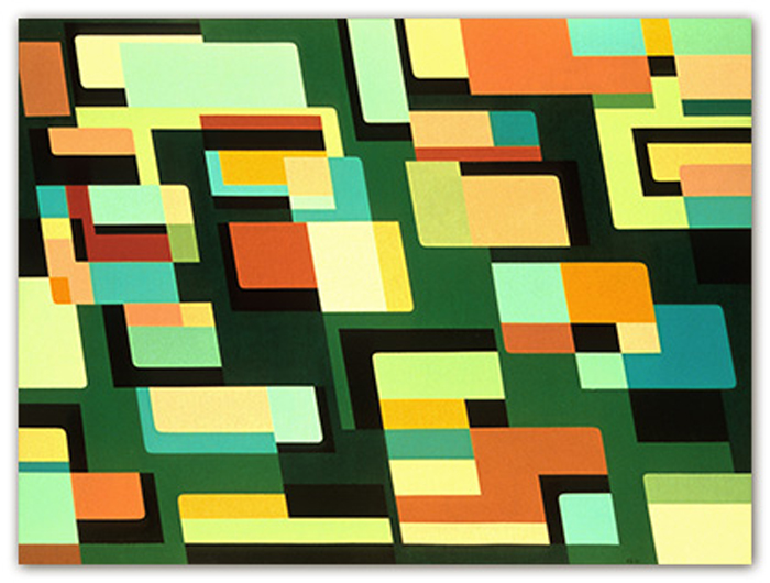
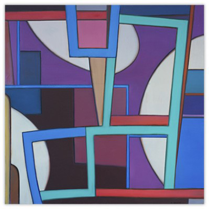
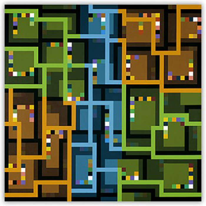
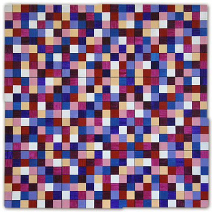
GEOFORM: The Many Sides of Geometry
Geoform (www.geoform.net) is an online scholarly resource and curatorial project, founded by Julie Karabenick almost 10 years ago. Its focus is on the use of geometric form and structure in contemporary abstract art. Artists included in this project number 260 and are from approximately 25 different countries. It is a monumental and amazing collection of some of the finest geometric art around.
The scope of work included in Geoform includes works on paper, works on canvas and panel, and sculpture utilizing traditional media to repurposed and recycled materials. These artists are inspired by nature, spirituality, music, poetry, mathematics as well as formal aspects of art like color and shape. The variety of formal structures used to organize these extraordinary works includes grids, optical illusions and universally recognized shapes like circles, dots, squares, rectangles, triangles and bands of color. Some work is reductive and minimal, other patterned and repetitive.
It was very difficult to limit my choice of work to only 20 artists, my self-imposed number, but I wanted to introduce the work of some unfamiliar artists as well as groundbreakers in the field of geometric art. My sincere apologies to all the wonderful work of colleagues whose work was not included.
Karl Benjamin, Red, Yellow, Green, oil on canvas, 1957
“Color in the hands of a painter resists verbal definition because it has nothing to do with words, nor with theories nor with physics of light. Color is the subject matter of painting.”
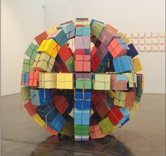
Kate Mackay, Large Round Cube, acrylic on cardboard with yarn, 2011
“The work has become progressively concerned with process and random difference within uniformity. Series of works are created by repeated combinations of simple elements concentrating on the repetition of blocks, squares and circles.”
William Conger, Red Summer, oil on canvas, 2012
“I want my paintings to be metaphorical in the sense that although they depict nothing abstracted, they are ‘as-if’ alternatives to our experiences in the world.”
Julie Karabenick, Composition 109, acrylic on canvas, 2010
“In the paintings from my ongoing series Composition Series, I limit myself to a few geometric shapes – to squares and rectangles of flat, uninfected color. From the stability and symmetry of the grid, I develop compositions that are to some degree asymmetrical and dynamically balanced.”
Ted Larsen, Loose Knot, salvage steel, welded steel, silicone, hardware, 2013
“I am constructing assemblages of deitrus in order to repurpose the materials and re-identify their meanings: to re-contextualize and re-label the idea of readymades.”
Yuli Geszti, Suite for 7 Colors to Celebrate the Overthrown Centenary Tree, acrylic on canvas, 2013
“My work is motivated by a challenge: to create the illusion of three-dimensional volumes on the flat surface of the canvas, using only brushes and ink.”
Per Formo, Ganymede 1, digital print on paper mounted on aluminum, 2012
“I want to make the act of looking into a conscious effort both to actually see what you’re looking at, and, at the same time, to observe the act of seeing: what you do when you see, how you are working at constructing visual meaning.”
Gudrun Mertes-Frady, Nest #20, oil and metallic pigments on canvas, 2013
“Architecture and geometry have always been present in my work; even in the earlier works, the underlying matrix was the grid.”
Tracey Adams, Radix 22, encaustic monotype, acrylic, oil glazes on panel, 2012
“I consistently have been drawn to forms that are sympathetic to structure, yet open to improvisation. Recent investigations into the mathematical expression of the proportional ratio found in nature, known as the Golden Section, have had an influence on my work”.
Steven Alexander, Palm (2), acrylic on canvas, 2013
“I am interested in the interaction between the painting and the viewer’s imagination, and in the painting’s potential to generate unspecified mobile meaning. Color operates in the world as a kind of pure energy – dynamic, capricious, evocative.”
Reese Inman, Migration II, acrylic on panel, 2011
“Each painting represents dialogue between a specific computer algorithm and my hand”
Gerhard Hotter, Pyramids XXXI, acrylic on canvas, 2013
“For more than 30 years I have been researching the pictorial and poetic potentials of mathematical structures. It’s the more playful part of mathematics-mathematics for its own sake – that attracts me.”
Herman Van de Poll, geoChao 145, acrylic and oil on linen, 2012
“My art has been influenced by modern scientific and mathematical approaches to understanding the complex order in nature.”
Julian Stanczak, Lumina, Offering Orange, acrylic on canvas, 1991
“My primary interest is color, the energy of the different wavelengths and their juxtapositions.”

Richard Kallweit, Triacontahedron Sphere, paper with offset printing, 2011
“I use various ideas culled from math and science to create paintings and sculptures. They are related in part to weaving technologies, which have been called the earliest higher mathematical discoveries of man.”
Amy Ellingson, Inverse Study #2, oil and encaustic on panel, 2010
“My interests lie in the practice of formal repetition, variation and mutation within limited serial systems and networks. The paintings consist of many interrelated layers of repeating geometric forms-lines, arcs and grids-that I compose on the computer.”
Grace DeGennaro, Ballinglen #21, watercolor on Somerset paper, 2013
“I am interested in the power of traditional symbols and sacred geometry to communicate ideas that lie beyond the limitations of language and culture.”
Raphael Durans, Pliage No. 116 (diptych), acrylic on canvas, 2011
“What interests me about all is proportion-what I call intuitive proportion. Using irregularly shaped canvases, I examine space beyond the square or rectangle.”
Joanne Mattera, Chromatic Geometry 13, encaustic on panel. 2013
“My paintings are succulent in color and reductive or repetitive in composition. I usually refer to my esthetic as “lush minimalism.”
Luciano Figueiredo, Relief #2, acrylic on canvas, 2009
“Throughout my years of making art, all of my research with basic formal elements such as color, volume, space and light has had a strong relationship with the other arts such as poetry, film, music and graphics as well.”
All images are courtesy of www.geoform.net. I invite you to visit the website and explore further the wealth and variety of geometric art and fascinating artist interviews that Julie has curated.
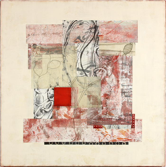
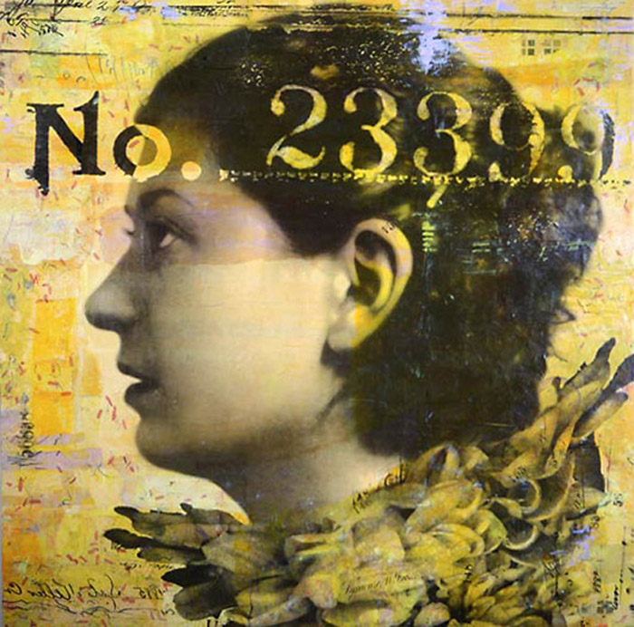
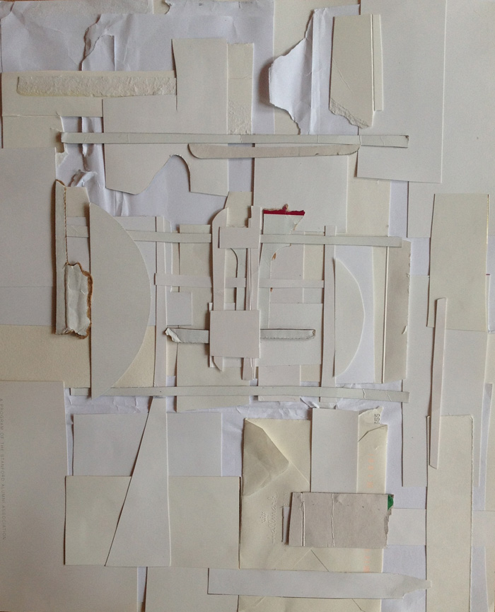
Collage: alchemy and transformation

Elaine de Kooning said it so well, “Collage is a marriage of accident and intention.” Collage is one of the most soul-satisfying studio practices I do at any time, any place and with any materials on hand. It functions like a journal posting in that I don’t often share it with others. It reflects my state-of-mind on a given day in that it can be dark, whimsical/fun, or meditative. It can be geometric, organic or a combination of both. It can be bright and colorful or monochromatic. While I never have an idea of where I’m going or what a collage will look like when finished, it is precisely that aspect that provides the necessary component of intrigue to keep me engaged. Sometimes, collage has sparked a new direction in my work so I try to let it have a life of its own. I love looking at other artists’ collages and assume that those of us who share this love of medium do it for similar reasons. Some collages are politically and narratively driven, some are playful and personal, and some have more formal intentions. Below is a group of some of my favorite collage artists.
Cecil Touchan, Untitled, www.searspeyton.com
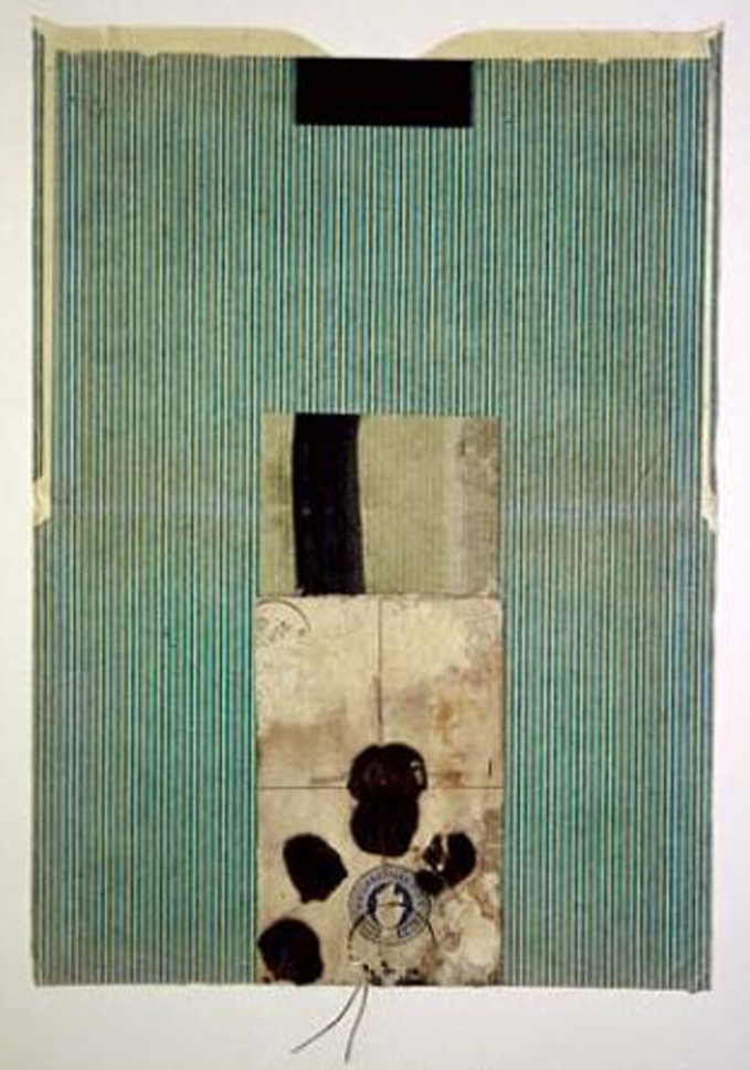
Dennis Parlante, Stability, www.dennisparlante.com
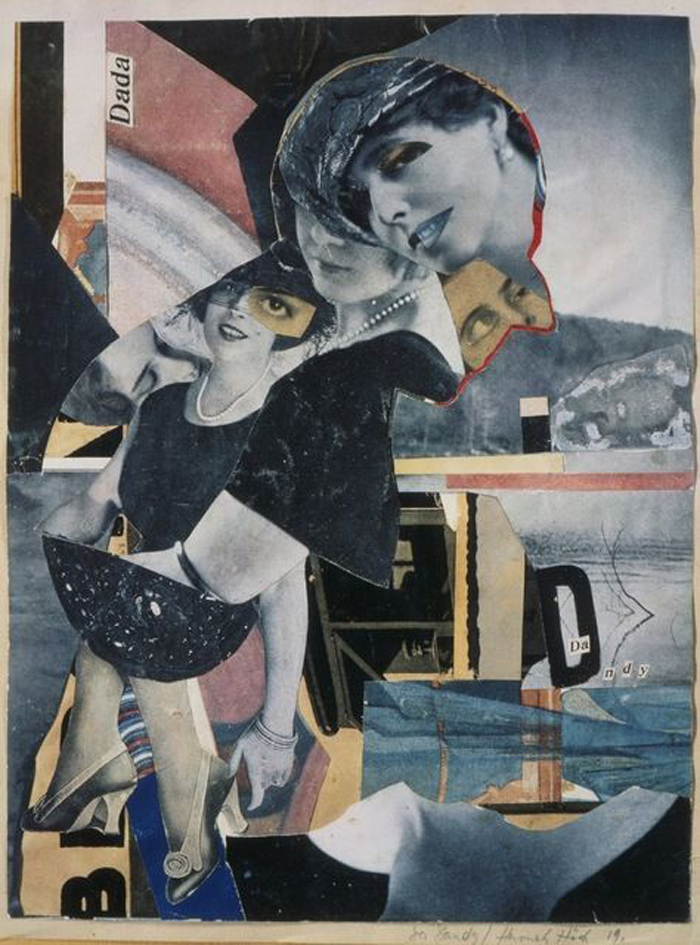
Hannah Hoch, Untitled, www.artsy.net
Tracey Adams, Radicle 14, www.montereyart.org

Kim Frohsin, Coke, Popcorn, Circus, Diamond, www.bryantstreet.com
Marybeth Rothman, Amelia, www.marybethrothman.com
Matt Gonzalez, White 1, www.sfcollagecollective.wordpress.com
Michael Cutlip, Bird-on-a-Wire, www.michaelcutlip.com
Michael Pauker, www.michaelpaukerblogspot.com
Kirsten Stolle, Genetic Erosion, www.kirstenstolle.com
Donna Sharrett, Magnificent, www.pavelzoubok.com
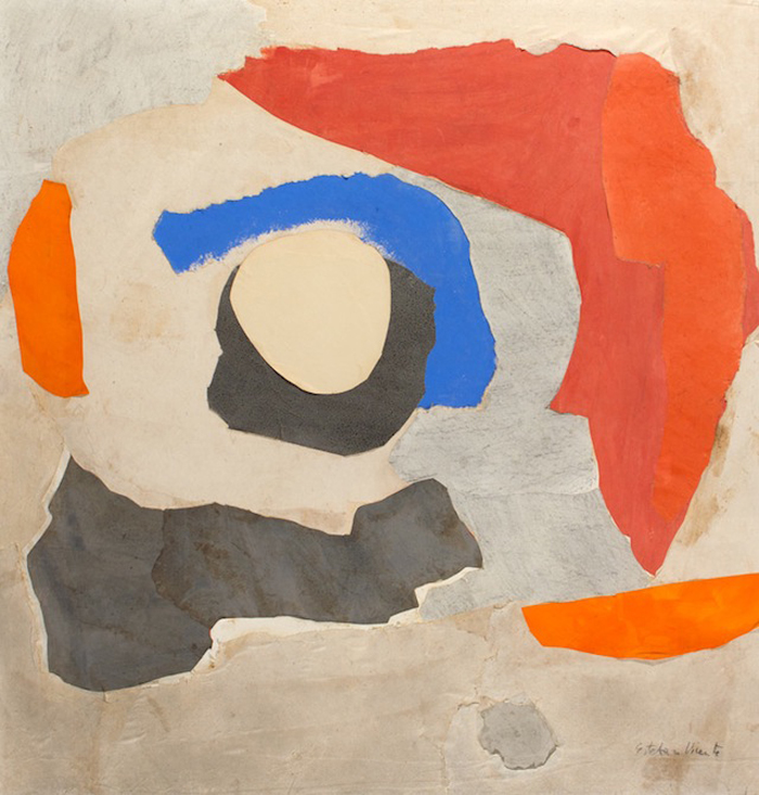
Esteban Vicente, Hawaii, www.hyperallergic.com
Maritta Tapanainen, Frontera, www.pavelzoubok.com
Cross-Pollination: east meets west
From 1945 through 1975, many artists from the U.S., through random exchanges, shared ideas and artistic styles with a group of Asian-American artists from Japan, China and Korea. While some of these artists were born in America and others emigrated, their influence and inspiration was seen and felt by many. Today, many of them remain in relative obscurity. Visually, their work contained calligraphic gestures learned from families and friends. Other work was reductive, incorporating large flat fields of color, sometimes featuring geometric shapes, repetition of lines and dots, suggesting nature in abstraction. Their work was connected to the philosophies of Buddhism, Confucianism, and Taoism – calling upon the self to be removed from focus, held at a distance. Cross-pollination occurred between the Asian artists and their non-Asian counterparts, from west to east coast and academia to exhibition.
Hans Hofmann, deeply influenced by the work of these Asian artists said, “The ability to simplify means to eliminate the unnecessary so that the necessary may speak.” The aesthetic of quiet elegance is powerful and remains influential and inspirational by many to this day. The following images include some favorite Asian and non-Asian artists as well as a few contemporary artists, myself included.

Hans Hofmann, Astral Nebula, www.hanshofmann.org

Wang Ming, Untitled, www.fairfield.edu

Tracey Adams, Imago 83, www.traceyadamsart.com

Mark Tobey, Night Celebration II, www.abstractartist.org

Seong Moy, Untitled, www.keithsheridan.com

Whanki Kim, Where, in What Form, Shall We Meet Again?, Courtesy of Gallery Hyandia

Jan Mueller, Seated Figures, Courtesy of Lori Bookstein Fine Art

Tracey Adams, Lumenis 9, www.traceyadamsart.com

Yutaka Ohashi, Stone Garden, www.guggenheim.org

Hans Hofmann, The Golden Wall, www.hanshofmann.org

Tremain Smith, Opening, www.tremainsmith.com

Masatoya Kishi, Opus No 64 C-11, www.askart.com

Howard Hersh, Skin Deep 7, www.howardhersh.com

Minoru Kawabata, Pink One, www.artfact.com

George Abend, Green, www.montereyart.org
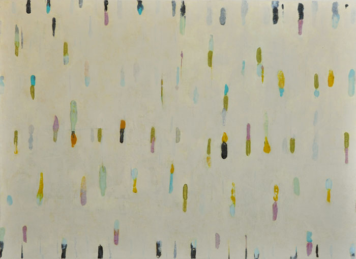
What’s New in the Studio….
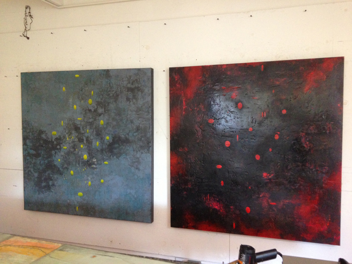
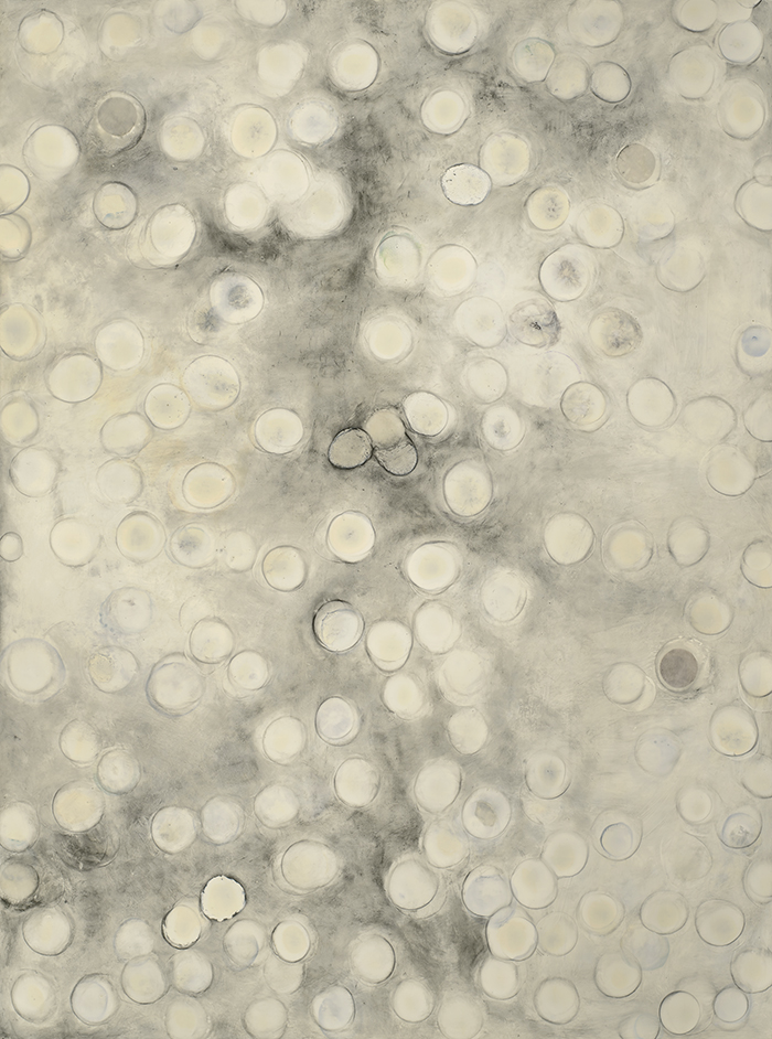
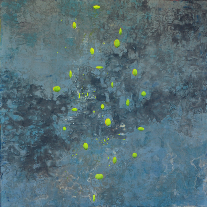
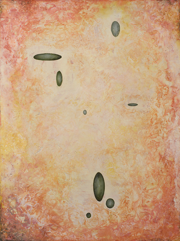
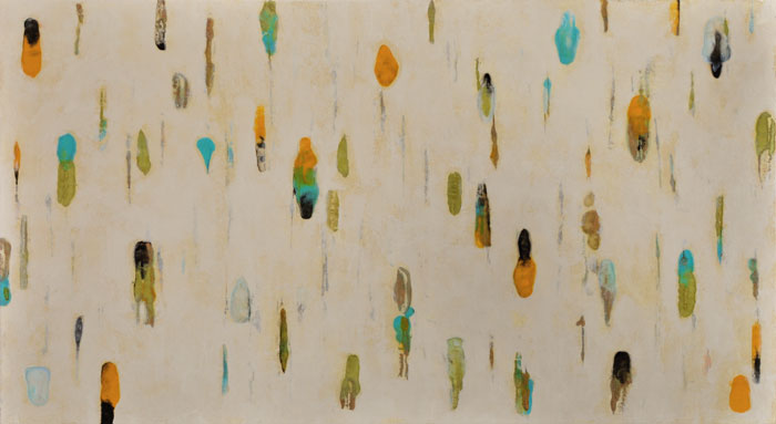
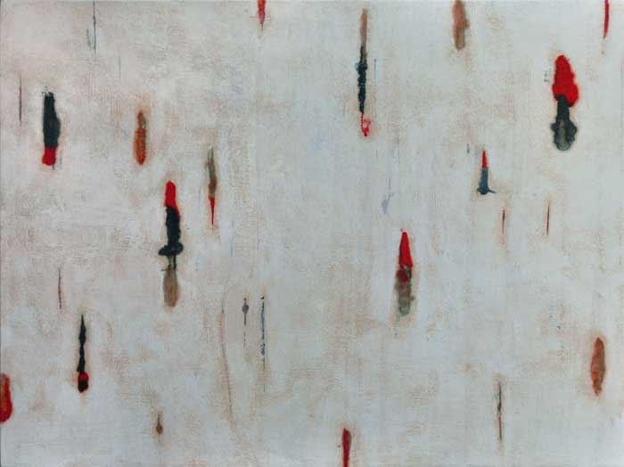
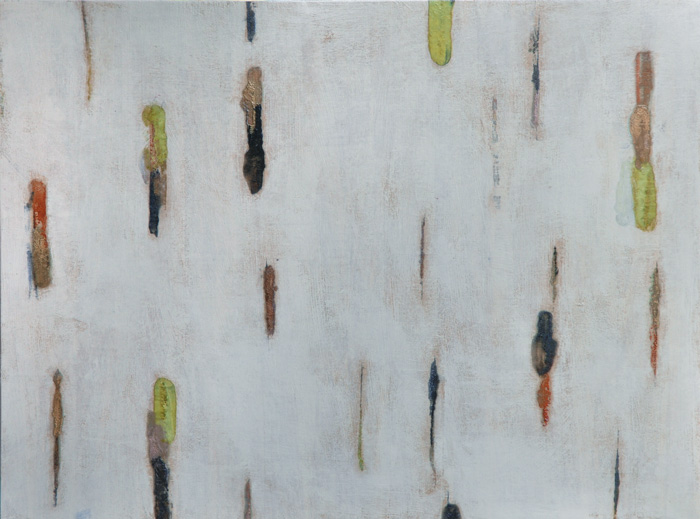
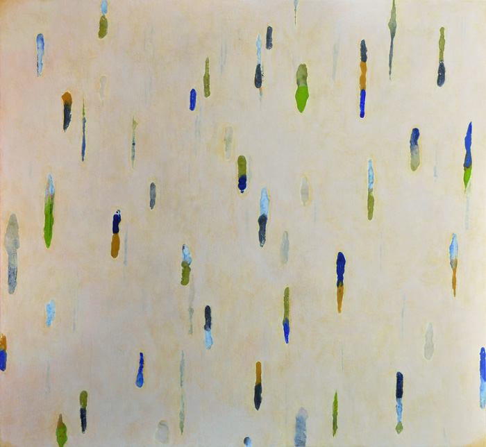
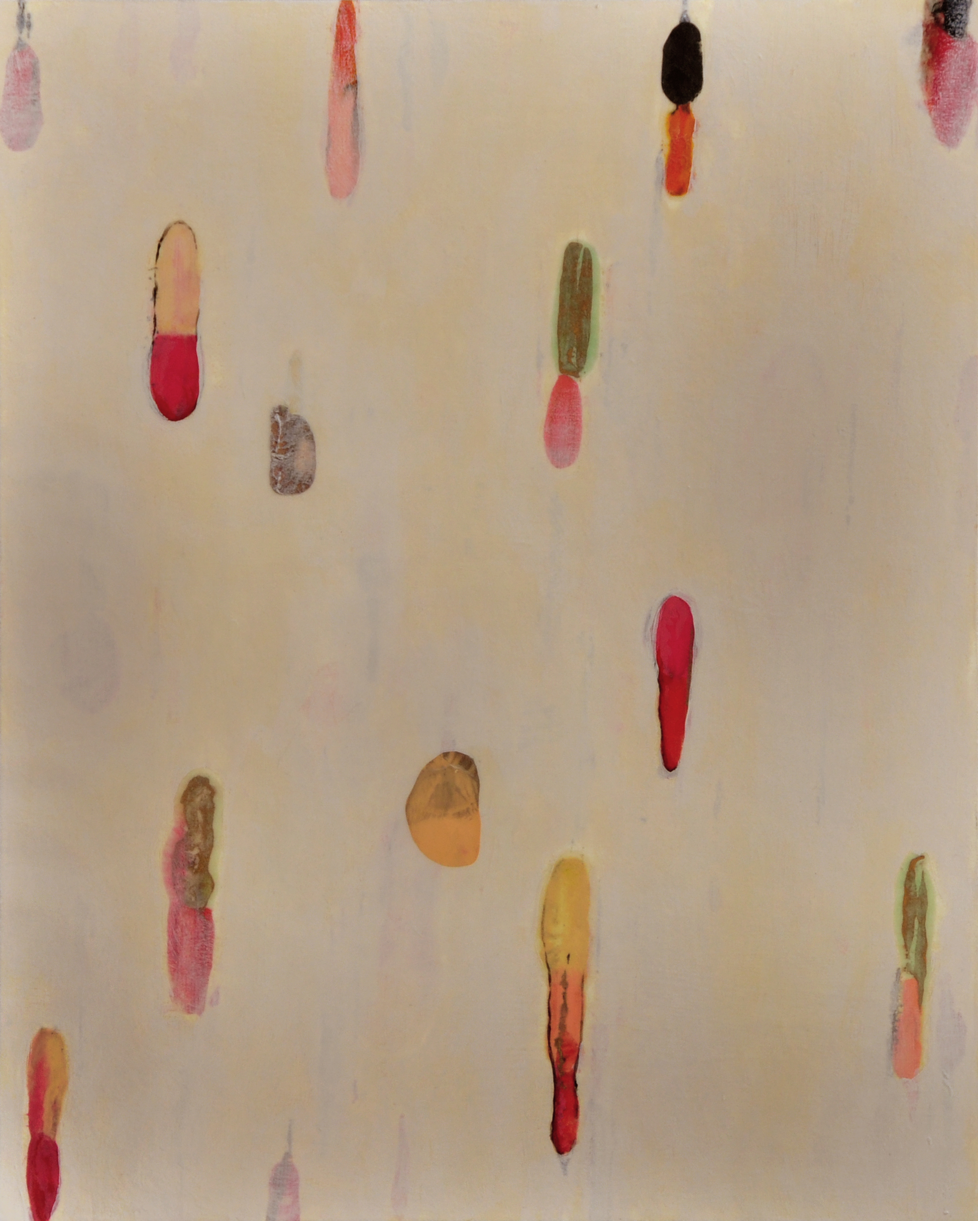
As we transition from longer days to shorter ones, I become more introspective and observe that my work continues to explore and cycle through past themes of numbers/music/circular shapes. Grapheme is a new series of paintings which focus on counting, color and my perception and interpretation of numbers and shapes as I fully experience color. Grapheme-color synesthesia has been described as the “smallest linguistic unit which may bring about a change or contrast of meaning.” Like all forms of synesthesia, grapheme-color synesthesia is for the individual involuntary, consistent and memorable. The experience differs from individual to individual. This new group of paintings is full of contrasts: hard edges of the ovoid shapes versus the softer, more cellular and aqueous ones; the patterns and rhythm of the different shapes versus the areas of quiet and repose; the topographic and textural surfaces versus those that are smooth. In this series, I use many layers of encaustic and oil to achieve luminosity and depth.
Grapheme 2, 48×48, encaustic and oil on panel
Grapheme 1, 48×46, encaustic and oil on panel
Grapheme 3, 40×30, encaustic and oil on panel
Grapheme 4, 40×30, encaustic and oil on panel
Grapheme 5, 40×30, encaustic and oil on panel
If you’re interested in learning more about encaustic, please check out this blog: www.prowaxjournal.com, filled with lot of great information.
On exhibition through October 5, 2013, Abstraction, Mark Gallery, Englewood, NJ (www.mark-gallery.com)
A Whirlwind of Activity this Spring
|
It’s spring and an abundance of good things are happening in the studio and in
|
||
|
||
|
||
|
|
||
|
I will be presenting a talk – Cannibalism and the Art of Collage –
|
||
|
||
|
||
|
||
|
||
|
||
  |

Lumenis: April 13 – May 12, 2013
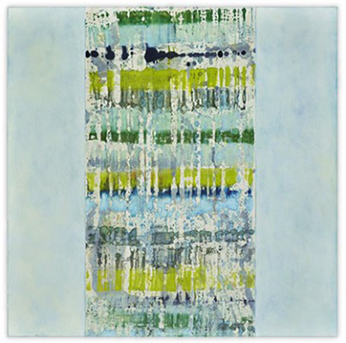
Lumenis, an exhibition of new paintings, will open at Winfield Gallery in Carmel, CA, on April 13, 2013. This series continues to explore my fascination and ongoing interest in the areas where art and music intersect and overlap: gesture, line, color space, pattern, etc. This series incorporates encaustic monoytpes (pigmented beeswax printed on Japanese papers) which are then collaged on panels and glazed with many layers of acrylic, then covered with cold wax. During graduate school as a music student, I was strongly influenced by the compositional principles of John Cage. Much of my collage work involves the process of indeterminancy, a process Cage created and worked with for much of his musical and artistic life. Decisions about mark-making involve parameters that are fixed or limited such as color, line, and shape. While I no longer perform music actively, the elements of music are deeply embedded in me, appearing in my paintings as visual compositions.
 Lumenis 9, encaustic monotype and acrylic glazes on panel, 39×54
Lumenis 18, encaustic monotype and acrylic glazes on panel, 16×40
Lumenis 15, encaustic monotype and acrylic glazes on panel, 36×20
Lumenis 8, encaustic monotype and acrylic glazes on panel, 48×39
Lumenis 13, encaustic monotype and acrylic glazes on panel, 43×22
Lumenis 12, encaustic monotype on panel, 36×36
Lumenis 10, encaustic monotype and acrylic glazes on panel, 39×54
Lumenis 16, encaustic monotype and acrylic glazes on panel, 24×16
Lumenis 14, encaustic monotype and acrylic glazes on panel, 22×39
Lumenis 19, encaustic monotype and acrylic glazes on panel, 18×24
 Lumenis 7, encaustic monotype and acrylic glazes on panel, 32×52
Lumenis 20, encaustic monotype and acrylic glazes on panel, 16×20
Lumenis 21, encaustic monotype and acrylic glazes on panel, 46×48
 Lumenis 17, encaustic monotype and acrylic glazes on panel, 24×16
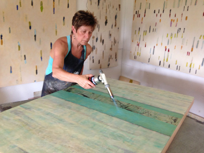
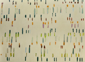
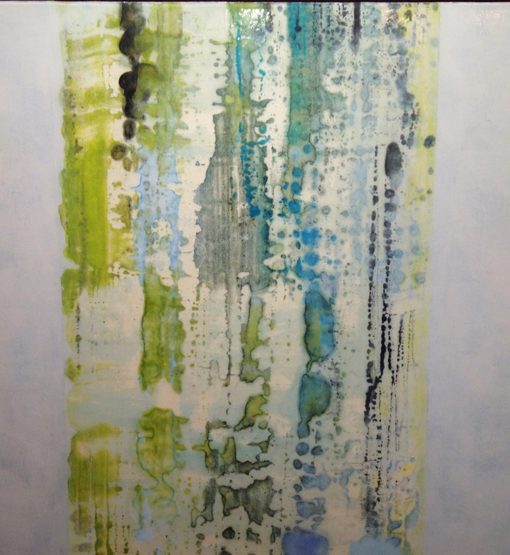
Moving Off the Grid
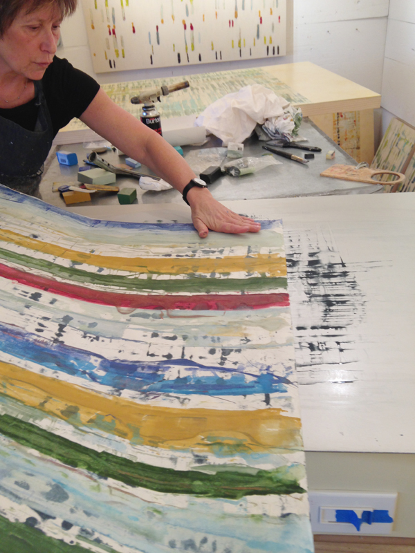
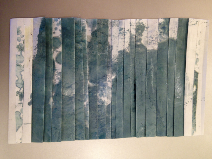
It’s been a few months since I last posted, but a busy time in the studio. I’ve been working on a new series, Lumenis, still in the early stage of evolution. This series is very connected to the place where music and art intersect and overlap. I continue to be inspired by the compositional principles of John Cage, those of “chance” music or “indeterminancy”. Decisions about mark-making involve parameters that are fixed or limited such as shape, color and spatial relationships. In addition, I have moved away from the grid as a compositional element for the first time in 30 years. All of the paintings begin with an encaustic monotype made on the Hot Box shown above, then adhered to the panel. Many layers of acrylic and oil are then applied.
The painting shown below is the last painting made using a grid. The ones that follow are, in order, the paintings as I respond to each one that went before it. While these are in the early stages of developing, I wanted to put them up for the new year.
Lumenis 14, 20×20

Lumenis 7, 32×52
Lumenis 4, 20×20
Lumenis 5, 20×20
Lumenis 6, 20×20
Lumenis 9, 39×54

Lumenis 8, 48×39
Lumenis 11, 22×39
I welcome any and all feedback!
An early birthday present: a day of working with Solarplates

Last Sunday, I was invited to spend the day printing with Solarplates at Equinox Press in Carmel Valley. Owner and Master Printer, Evelyn Klein, guided and helped me through each stage of the process. A Solarplate is light-sensitive steel backed with a polymer material. It is a wonderful alternative to more toxic printing techniques, which I’m all too familiar with, as well as a relatively fast way to make a beautiful print. These plates can be used to make an edition of prints, collage materials or they can be mounted on panels.

The first thing I did was to make a series of drawings with India ink and other mark-making media on clear acetate.

The Solarplate is exposed to a UV source (light box or direct sun) and is developed in tap water, until the gel-like emulsion dissolves the unexposed portion of the plate.

The Solarplate is inked with etching ink and is wiped using the same method one would use to wipe and intaglio plate. The plate is on the press waiting to be printed.

I wasn’t totally pleased with my first print as the darkest blacks appeared as gray, mid-tones. I learned we needed to expose the plate for a shorter amount of time to increase the saturation of the darkest tones.

This is my second drawing on acetate before the plate was exposed to light, developed, inked and printed.

The first inking with black ink produced pleasing results!

This is the plate with black ink in the incised lines and a viscosity roll of green ink (much thinner), rolled on top. The orange areas are where I wanted the white paper to show so I didn’t ink those areas.

This is the final print with another viscosity roll of green ink over the entire plate this time. I decided I preferred to have the entire plate covered as I found the white areas distracting. This is an exciting way to print safely, one that produces fabulous results. I hope I have the opportunity to try this again!
10 Things That Inspire My Creative Process

Hot off the press – what I’m working on at the moment…..
1. Music, from Gregorian chant to Philip Glass
2. The smell of oil-based etching ink and paint
3. Patterns, especially stripes
4. Time spent in Bali in 2005
5. Yoga and Patanjali’s Eight-Fold Path
6. The graphite gray fog that settles on our hill as the sun shines on the town below us
7. Teaching and learning from my students
8. Growing my own food and cooking
9. Understanding that true freedom comes from discipline
10. The love and support of family and friends
Oblique Intention: Bryant Street Gallery, Palo Alto, CA, September 2012
It was a warm September evening for the reception at Bryant Street Gallery in Palo Alto. Thanks to all friends and collectors who attended.

Joanne Imperial is the new collector of the largest and smallest painting in the exhibition: Radix 20, 40×60, mixed media and Collage 10, 18×13, collage on panel

Susan Hewitt thinking about Radical 39, 45×45, mixed media

Artist Thea Shrack and her daughter, Monette

Artist Marti Somers next to Radix 21

Gallery owner Karen Imperial, Tracey and collector, Joanne Imperial

4 collages from the Fresno Art Museum exhibition: Between Gesture and Geometry, 2011

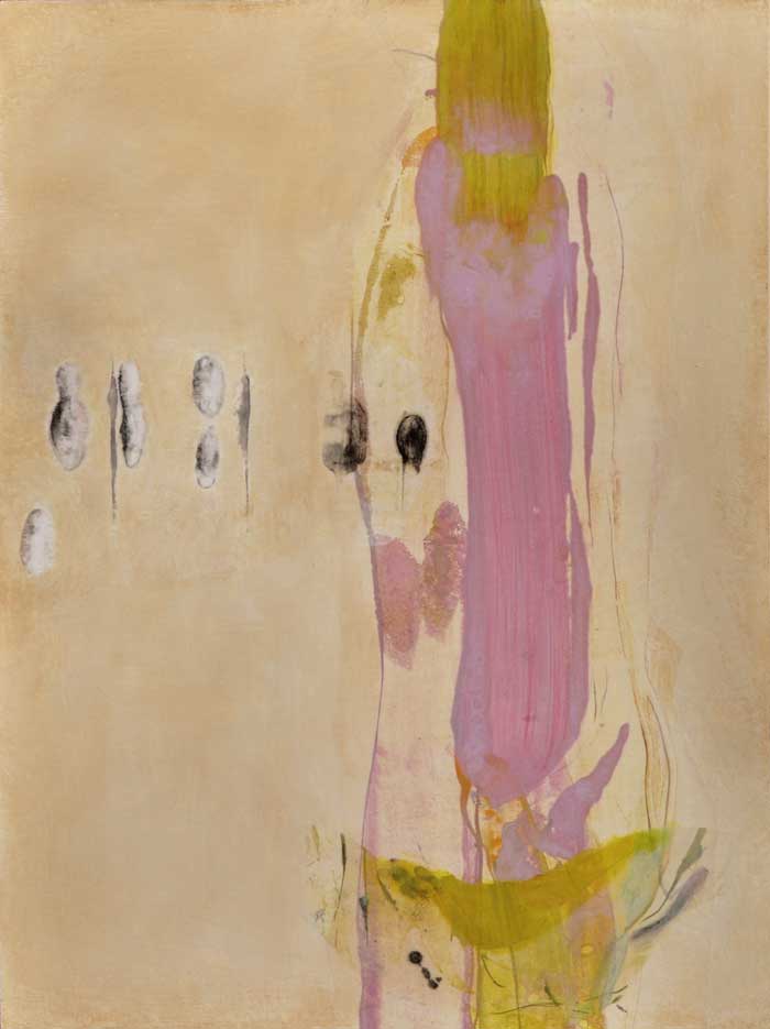
Oblique Intention: new process, new work
My upcoming show, Oblique Intention, opens at Bryant Street Gallery in Palo Alto on September 1. The Opening Reception will be Friday, September 7 from 6 – 8 pm.

Radix 25, Mixed Media on Panel, 40×60
The paintings that will be shown in this exhibition represent a year’s departure from working exclusively in encaustic – encaustic monotype with thin layers of encaustic color in the surrounding area. For many reasons, I found it necessary to explore another media that would reflect what my work is about and the reason I paint. After all, my work has never entirely been about the encaustic surface, as beautiful as it is. I needed a change after 15 years of working with encaustic, so I started experimenting and exploring. There were many rough spots along the way, but that’s what I crave from the creation process.

Radix 21, Mixed Media on Panel, 40×40
This new body of work is a group of paintings composed of an encaustic monotype, sometimes a single fragment mounted on panel, and sometimes multiple fragments collaged and mounted together (see last Blog). In the surrounding areas, I’ve painted many thin layers of pigmented glazes, a process I learned in the 80’s from British artist, Hugh O’Donnell. He taught me how to apply paint the way he believed Rembrandt did. I love balancing this classical approach of handling paint with the resulting abstract imagery.

Radix 32, Mixed Media on Panel, 40×40
It takes an infinite amount of patience to, not only let each layer dry, but to see the subtle shifts of color when a new layer of glaze is applied. One can’t work quickly as in encaustic. – there’s a much slower tempo. Sometimes I sand in between applications of paint, sometimes I just add another layer. Some paintings have as many as 20-25 layers in order to create the quality of light and movement I need. There have been some nice surprises along the way such as a more highly defined surface versus the translucent and sometimes more distant surface of encaustic.

Radix 30, Mixed Media on Panel, 36×36
The title of the exhibition, Oblique Intention, comes from a combination of the meaning of oblique – not straightforward, more indirect or indirectly stated – and the word intention – a specific purpose, an aim, something to direct the mind towards. My work these days, always a reflection of my life and world, seems to move in those directions. My paintings have always had very subtle qualities that invite the willing viewer in for a closer look and opportunity to spend more time. This body of work is no exception. The contrast between the active and often colorful gestural work in the monotypes and the quiet color fields is a balance I strive for. A counterpoint also exists between the underlying grid/geometric format of the composition and the organic linear movement.

Radix 20, Mixed Media on Panel, 40×60
collage, chine collé, à coller
I often ask myself why I enjoy collage. What is it about assembling and reconfiguring different bits of paper – in my case drawings, etchings, and monotypes – that is so satisfying? Creating a visual perspective by connecting seemingly disparate fragments so that, hopefully, they work together successfully is like locating the missing piece in a jigsaw puzzle. It’s a pleasing moment for sure.
Some of my earlier collages were attempts to deal with my frustration with painting. Collage represented something I could do that was intimate, not involving large amounts of time or expense.

Collage 23, 17×13

Collage 24, 13×17

Collage 27, 17×13
They were fast and fun, using fragments of materials on hand. I made a promise to myself not to go back and rework them, just to keep making more, otherwise I wouldn’t see where this process was going to take me. After looking at over 30 of these, spread out on my studio floor, I decided to mount one on a panel, painting a color field in the surrounding area, a process I had been doing for a long while . I liked where it was going and continued to work on larger collages.

Radicle 6, Encaustic, 40×40

Radix 10, Mixed Media on Panel, 40×40

Radix 13, Mixed Media on Panel, 40×40

Radicle 9, Encaustic, 40×30
My eye would follow, as a musician might read a line of music: a new order and perspective was created by the juxtaposition of lines and shapes.
Sometimes I found myself focusing entirely on these intersecting black lines, as they weaved in and out of focus, sections of them covered by other lines that had been added through this collage process. Now it was getting fun.

Radix 17, Mixed Media on Panel, 30×30

Radix 18, Mixed Media on Panel, 30×30

Radix 19, Mixed Media on Panel, 30×30
Dimensional planes were being created that hadn’t appeared before, a subtle sense of depth and space, inviting the viewer to look more closely.
There are days I work on a sole fragment (my next Blog), enjoying the simplicity of one, rather than many. I feel very fortunate to be able to go back and forth working between the 2 processes with equal enjoyment and ease. Each time I return to working with multiple fragments or working with a single piece, I’m influenced by what I’ve been doing with the other and look forward to seeing where the process then takes me.

Radix 1a, Mixed Media on Panel, 30″x60″
Here’s a link to a Blog about collage which includes my work: sfcollagecollective.wordpress.com
Oblique Intention: Patricia Rovzar Gallery, Seattle, WA, July 2012

Art Access Magazine, July 5, 2012


Sometimes you just gotta let go…..
I’ve been working on a particular painting for 10 months, loving some aspects of it, not loving the rest. Basically, it was not working for me and I was too attached to let it go. It seemed no matter how many layers of glaze I added, I couldn’t get it right. The issue involved the size of this particular panel and the composition. In the back of my mind, I knew what needed to be done, but didn’t want to do it. How could I cover up months of hard work developing such a beautiful surface? My decision was to turn it towards the wall where I didn’t have to be reminded of this on a daily basis.

Last Friday, I decided to add a couple of collage fragments, upset the compositional balance and paint over much of the painting’s surface. It was liberating to say the least. I could actually see where it needed to go. It was like holding up a mirror and looking at myself. I include a photo of the just-painted-over surface and will update as the old painting undergoes transformation.

Even though I’ve been painting for over 30 years, some paintings catch you by surprise, totally perplex you and, hopefully, become your greatest teachers. It took me almost a year, and this is the completed painting…

Celebrating 30+ years of being an artist
In writing my first Blog ever, I want to acknowledge how fortunate I am to have found my way into this amazing thing called art. I remember my first day as a graduate student at the New England Conservatory of Music in Boston. It was September of 1978 and I had been painting during the sweltering summer in my third floor studio apartment. All I wanted to do was continue painting and yet, I had recently committed to spending 2 years studying Conducting in school. This was a difficult decision especially considering I had a scholarship which would cover many of my expenses as a music student.
Jumping ahead to when I finished my music degree 2 years later, having taken as many art classes simultaneously as possible, I decided to move home to the west coast, I found whatever space I could to draw and paint. The kitchen became my new studio, putting everything away at night and converting it back to a place to cook and eat. I craved my very own studio, somewhere I could go to delight in this wonderful process of art making. I spent all my waking hours thinking about art, trying to find a way to make a new studio materialize.

Skipping ahead to 1992, my husband and I moved to Carmel, one of the most amazing places on earth, where we were surrounded by trees and exquisite beauty. I finally had my own place to paint. So much has happened in the 20 years since the summer we moved here: incredible exhibition opportunities, inspiration and growth and lots of hard focused work. It is fun to watch the evolution of my process especially since I work in series, many of which are shown under Art. While much has improved and evolved in the way I paint, the concept behind my art making has remained the same.
It seems fitting that I am celebrating 20 years of living in Carmel with the launch of my new website and Blog. There are so many people to thank and so much to be grateful for. Check in occasionally for some thoughts and ideas about the art process. Here’s to another 30 years of creativity!